
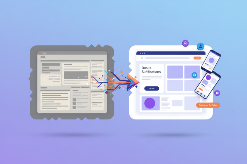
Website Redesign: Strategies to Improve User Experience
Your website is often the first impression potential customers have of your business. In today’s digital landscape, where attention spans are shorter than ever and competition is fierce, having a website that delivers exceptional user experience isn’t just nice to have—it’s essential for survival. If your website feels outdated, loads slowly, or frustrates visitors, you’re not just losing potential customers; you’re actively driving them to your competitors.
Website redesign isn’t just about making things look prettier, though aesthetics certainly matter. It’s about creating a seamless, intuitive experience that guides users effortlessly toward their goals while meeting your business objectives. Whether you’re seeing declining conversion rates, poor mobile performance, or simply feeling like your site doesn’t reflect your brand anymore, a strategic redesign can transform your online presence and boost your bottom line.

Understanding the Foundation: What Makes User Experience Great
Before diving into redesign strategies, it’s crucial to understand what user experience really means. User experience encompasses every interaction a visitor has with your website, from the moment they land on your homepage to when they complete a purchase or contact you for services. It’s the sum of usability, accessibility, performance, and emotional response.
Great user experience feels invisible to users because everything works exactly as they expect it to. Navigation is intuitive, pages load quickly, content is easy to read and understand, and completing tasks feels natural rather than frustrating. When users can accomplish their goals without thinking about how to use your website, you’ve achieved excellent UX.
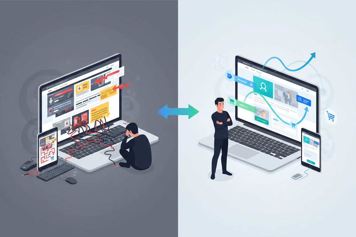
Poor user experience, on the other hand, creates friction at every turn. Users struggle to find information, buttons don’t work as expected, pages take forever to load, and the overall experience leaves visitors feeling confused or annoyed. This friction directly translates to lost opportunities and revenue.
Conducting a Comprehensive UX Audit Before Redesigning
Smart website redesigns don’t start with choosing colors or layouts—they begin with understanding what’s currently working and what isn’t. A thorough UX audit reveals the specific pain points your users experience and provides data-driven insights to guide your redesign decisions.
Start by analyzing your website analytics to identify patterns in user behavior. Look at metrics like bounce rate, time on page, conversion rates, and exit pages. High bounce rates might indicate that your landing pages aren’t meeting user expectations, while low time on page could suggest content isn’t engaging or relevant.
Heat mapping tools provide invaluable insights into how users actually interact with your pages. You’ll see where people click, how far they scroll, and which elements they ignore completely. This data often reveals surprising disconnects between what you think users want and what they actually do.
Don’t forget to gather qualitative feedback through user surveys, interviews, or usability testing sessions. Real user feedback often uncovers issues that data alone might miss. Users might express frustration with specific features or suggest improvements you never considered.
Mobile-First Design: Prioritizing the Modern User Journey
With mobile devices accounting for over half of all web traffic, designing for mobile isn’t optional—it’s fundamental. Mobile-first design means starting your redesign process by creating the best possible experience for smartphone users, then scaling up to larger screens.
Mobile users have different needs and constraints than desktop users. They’re often on the go, have limited screen space, and may be dealing with slower connections or distractions. Your mobile design should prioritize essential content and actions, making it easy for users to complete key tasks with minimal effort.
Consider how touch interactions differ from mouse clicks. Buttons need to be large enough for fingers to tap accurately, and interactive elements should be spaced appropriately to prevent accidental taps. Navigation menus that work well with a mouse might be clunky on touchscreens, requiring creative solutions like hamburger menus or bottom navigation bars.
Page speed becomes even more critical on mobile devices. Optimize images, minimize code, and consider implementing progressive web app features to create fast, app-like experiences that work seamlessly across all devices.
Streamlining Navigation and Information Architecture
Your website’s navigation is like a roadmap for your users. If it’s confusing, cluttered, or illogical, even the most motivated visitors will struggle to find what they’re looking for. Effective navigation should be intuitive enough that users never have to think about how to get where they want to go.
Start by organizing your content based on user needs rather than internal company structure. What makes sense to your organization might be completely foreign to your customers. Use card sorting exercises or tree testing to understand how your target audience naturally categorizes information.
Keep your main navigation menu focused on the most important sections of your site. Too many options create decision paralysis and make it harder for users to choose. Consider using mega menus for sites with extensive content, but ensure they’re well-organized and don’t overwhelm users with choices.
Breadcrumb navigation helps users understand where they are within your site hierarchy and provides an easy way to backtrack. Search functionality becomes crucial for content-heavy sites, but make sure your search results are relevant and well-organized.
Optimizing Page Speed and Performance
In our instant-gratification culture, slow websites are abandoned websites. Research shows that 40% of users will leave a site that takes more than three seconds to load, and even small improvements in speed can significantly impact conversion rates and user satisfaction.
Image optimization often provides the biggest performance gains with the least effort. Compress images without sacrificing quality, use modern formats like WebP when possible, and implement lazy loading so images only load when users scroll to them. Consider using a content delivery network to serve images and other static assets from servers closer to your users.
Minimize HTTP requests by combining CSS and JavaScript files where possible. Remove unused code and plugins that add unnecessary bloat to your pages. Every element that needs to load separately adds time to your page load speed.
Choose your hosting provider carefully, as server response time directly impacts user experience. Shared hosting might be budget-friendly, but it often comes with performance trade-offs that can hurt user experience and search engine rankings.
Creating Intuitive User Interfaces and Visual Hierarchy
Visual hierarchy guides users through your content in order of importance, helping them quickly understand what matters most on each page. Effective visual hierarchy uses size, color, contrast, and spacing to create a clear path through your content.
Your most important elements should be the most prominent. Headlines should be larger than body text, call-to-action buttons should stand out from other page elements, and critical information should be positioned where users naturally look first.
White space isn’t wasted space—it’s a powerful design tool that improves readability and helps important elements stand out. Don’t feel compelled to fill every inch of your pages with content. Strategic use of white space makes your site feel more professional and easier to navigate.
Consistency in your interface elements builds user confidence. Buttons should look and behave similarly throughout your site, navigation elements should appear in expected locations, and your color scheme should reinforce your brand while maintaining good contrast for accessibility.
Implementing Effective Content Strategy During Redesign
Content isn’t just words on a page—it’s the primary way you communicate value to your users. Your redesign provides an opportunity to audit existing content, eliminate what isn’t working, and create new content that better serves your users’ needs.
Start by identifying the key questions your target audience has at different stages of their customer journey. New visitors might need basic information about your products or services, while returning customers might be looking for support resources or account management tools.
Write for scanability, as most web users scan rather than read word-for-word. Use descriptive headings, bullet points, and short paragraphs to make your content easy to digest. Important information should be front-loaded in paragraphs, with supporting details following.
Your content should speak your users’ language, not internal jargon. If you wouldn’t say it in a face-to-face conversation with a customer, reconsider whether it belongs on your website. Clear, conversational content builds trust and makes complex topics more accessible.
Testing and Measuring Success Post-Launch
Launching your redesigned website isn’t the finish line—it’s the starting point for ongoing optimization. The most successful websites are continuously tested and refined based on real user behavior and feedback.
A/B testing allows you to compare different versions of pages or elements to see which performs better. You might test different headlines, button colors, or page layouts to optimize conversion rates. Start with high-impact elements that directly affect your business goals.
Set up proper analytics tracking before launch to establish baseline metrics for comparison. Monitor key performance indicators like conversion rates, bounce rates, average session duration, and goal completions. Pay attention to both overall trends and specific page performance.
User feedback remains valuable post-launch. Consider implementing feedback widgets, conducting periodic user surveys, or running usability testing sessions on your new design. Users often discover issues or opportunities that weren’t apparent during the design process.
Conclusion: Your Path to Better User Experience
Website redesign is an investment in your business’s future, but it requires careful planning and execution to deliver real results. By focusing on user needs rather than internal preferences, prioritizing performance and accessibility, and committing to ongoing optimization, you can create a website that not only looks great but actually drives business growth.
Remember that great user experience is an ongoing process, not a one-time project. Technology evolves, user expectations change, and your business grows. The most successful websites are those that adapt and improve continuously, always keeping user needs at the center of decision-making.
Start your redesign journey by understanding your current users’ experiences, then implement changes systematically while measuring results. With patience, attention to detail, and a genuine commitment to serving your users better, your redesigned website can become a powerful tool for achieving your business objectives while delighting everyone who visits.
No More BS – Get a FREE Consultation
No more BS. Let’s talk real world $#!+ about what you need. You’ll meet with our top dog, and you’ll leave with a better understanding of what you need to do, and how RyCOM might help.