
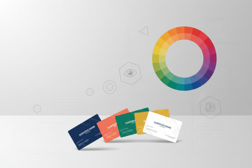
Business Card Design: The Psychology of Color and Layout
In today’s digital age, you might think business cards have lost their relevance. But here’s the thing – they haven’t. If anything, a well-designed business card has become even more powerful because it stands out in our screen-dominated world. The secret lies not just in having a card, but in understanding how color psychology and strategic layout can make your business card an unforgettable marketing tool.
When someone hands you their business card, you form an impression within seconds. That tiny piece of paper communicates volumes about their professionalism, attention to detail, and brand identity. The colors they choose and how they arrange the information can trigger specific emotional responses and influence whether you’ll remember them or toss their card in the nearest drawer.

The Science Behind Color Psychology in Business Cards
Color psychology isn’t just marketing fluff – it’s rooted in genuine psychological research. Our brains are wired to respond to colors in predictable ways, often triggering emotional and behavioral responses we’re not even consciously aware of. When it comes to business card design, understanding these responses can be the difference between making a lasting impression and being forgotten.
Think about the last time you walked into a fast-food restaurant. Notice how many use red and yellow? That’s no coincidence. Red stimulates appetite and creates urgency, while yellow evokes happiness and energy. The same principles apply to your business card, just with different objectives in mind.
Research shows that people make subconscious judgments about trustworthiness, competence, and reliability based on color choices alone. A financial advisor using hot pink might struggle with credibility, while a creative agency using beige might appear boring and uninspired. The key is aligning your color choices with your industry expectations and personal brand goals.

Red: Power, Passion, and Attention-Grabbing Energy
Red is the color of action. It’s bold, confident, and impossible to ignore. If your business thrives on energy, urgency, or passion, red might be your perfect match. Real estate agents often incorporate red because it suggests dynamism and results-oriented service. Restaurant owners love red because it literally makes people hungrier.
However, red comes with warnings. It can appear aggressive or overwhelming if used excessively. The trick is using red strategically – perhaps as an accent color for your name or a small design element rather than dominating the entire card. A splash of red can energize your design without making you look like you’re shouting for attention.
Blue: Trust, Stability, and Professional Reliability
Blue is the corporate world’s favorite color, and for good reason. It’s associated with trustworthiness, stability, and intelligence. Banks, insurance companies, and tech firms gravitate toward blue because it communicates reliability and competence. If your business requires clients to trust you with their money, health, or important decisions, blue can work wonders.
The beauty of blue lies in its versatility. Navy blue suggests authority and expertise, perfect for lawyers or consultants. Lighter blues feel more approachable and friendly, ideal for healthcare providers or customer service businesses. Teal adds a modern, creative twist while maintaining blue’s trustworthy foundation.
Green: Growth, Nature, and Financial Success
Green carries multiple powerful associations. It’s the color of money, making it popular among financial services. It’s also the color of nature, appealing to environmentally conscious businesses and outdoor industries. Additionally, green represents growth and renewal, perfect for companies focused on development or improvement.
Different shades of green tell different stories. Forest green feels established and trustworthy, while bright lime green appears innovative and energetic. If you’re in landscaping, environmental consulting, or financial planning, green can reinforce your brand message before you even speak.
Black and White: Timeless Elegance and Sophisticated Simplicity
Sometimes the most powerful choice is the absence of color. Black and white business cards exude sophistication, elegance, and timeless appeal. They work particularly well for luxury brands, high-end services, and creative professionals who want their work to speak louder than flashy colors.
Black suggests authority, luxury, and exclusivity. White represents cleanliness, simplicity, and fresh starts. Together, they create striking contrast and ensure excellent readability. Plus, black and white cards often cost less to print, making them budget-friendly without looking cheap.
Strategic Layout: Guiding the Eye and Maximizing Impact
Color grabs attention, but layout guides the conversation. How you arrange information on your business card determines what people notice first, what they remember, and how easily they can contact you later. Poor layout can make even the most beautiful colors ineffective.
The human eye follows predictable patterns when scanning information. In Western cultures, we read left to right and top to bottom. Understanding this natural flow helps you position the most important elements where they’ll have maximum impact. Your name should be prominent, but not necessarily the largest element if your company brand is more recognizable.
The Rule of Hierarchy: What Gets Noticed First
Visual hierarchy determines the order in which people process information. Start with what’s most important for your specific goals. If you’re networking at industry events where your personal reputation matters most, make your name the star. If you’re representing a well-known company, lead with the logo and brand.
Size, color, and positioning all contribute to hierarchy. Larger elements get noticed first, followed by high-contrast colors, then items positioned in the upper left corner. Use these principles strategically rather than making everything large and bold, which creates visual chaos instead of clear communication.
White Space: The Unsung Hero of Professional Design
White space isn’t wasted space – it’s breathing room that makes your card feel professional and easy to read. Cramming every millimeter with information makes your card look cluttered and desperate. Strategic white space suggests confidence and sophistication.
Think of white space as the pause between sentences in a conversation. It gives people time to process one piece of information before moving to the next. A card with proper white space feels calm and organized, while an overcrowded card creates stress and confusion.
Typography Choices: Readability Meets Personality
Your font choices communicate personality just as powerfully as colors do. Serif fonts like Times New Roman feel traditional and established, perfect for law firms or financial institutions. Sans-serif fonts like Arial appear modern and clean, ideal for tech companies or creative agencies.
However, personality means nothing if people can’t read your information. Avoid overly decorative fonts for contact details, no matter how perfectly they match your brand aesthetic. Save creative typography for your name or company title, then use clean, readable fonts for phone numbers and email addresses.
Cultural Considerations: Colors Across Different Markets
If your business serves diverse markets, remember that color meanings vary across cultures. Red symbolizes good fortune in China but can represent danger in Western cultures. White suggests purity in America but mourning in some Asian countries. Research your target market’s cultural associations before finalizing your design.
This doesn’t mean you need different cards for every culture, but it does mean being aware of potential misinterpretations. When in doubt, test your design with people from your target demographics or consult with cultural experts in your industry.
Practical Tips for Implementing Color Psychology
Start by identifying three words that describe your ideal brand perception. Do you want to appear trustworthy? Creative? Energetic? Use these words to guide your color selection process. Create a small test batch of cards in different color schemes and ask trusted colleagues or clients for honest feedback.
Consider your industry norms, but don’t be afraid to stand out appropriately. If every competitor uses blue, a well-chosen green or purple might help you be memorable without appearing unprofessional. The goal is differentiation, not rebellion.
Remember that colors look different on screen versus print, and printing quality affects final results. Always request physical samples before ordering large quantities, and work with reputable printers who can match colors consistently.
Conclusion: Making Every Card Count
Your business card is often the first tangible representation of your brand that people take home. By understanding color psychology and strategic layout principles, you can create cards that not only look professional but actually influence how people perceive and remember you.
The most effective business cards balance psychological impact with practical functionality. They use colors that align with brand goals and industry expectations while maintaining layouts that guide the eye naturally and make information easy to find. Remember, the best business card design is one that serves your specific business objectives while respecting the psychological principles that influence human behavior.
Take time to consider what impression you want to make, then use color and layout strategically to support that goal. Your business card might be small, but its impact on your professional success can be enormous.
No More BS – Get a FREE Consultation
No more BS. Let’s talk real world $#!+ about what you need. You’ll meet with our top dog, and you’ll leave with a better understanding of what you need to do, and how RyCOM might help.