
Billboard Design: Crafting Messages for Quick Consumption
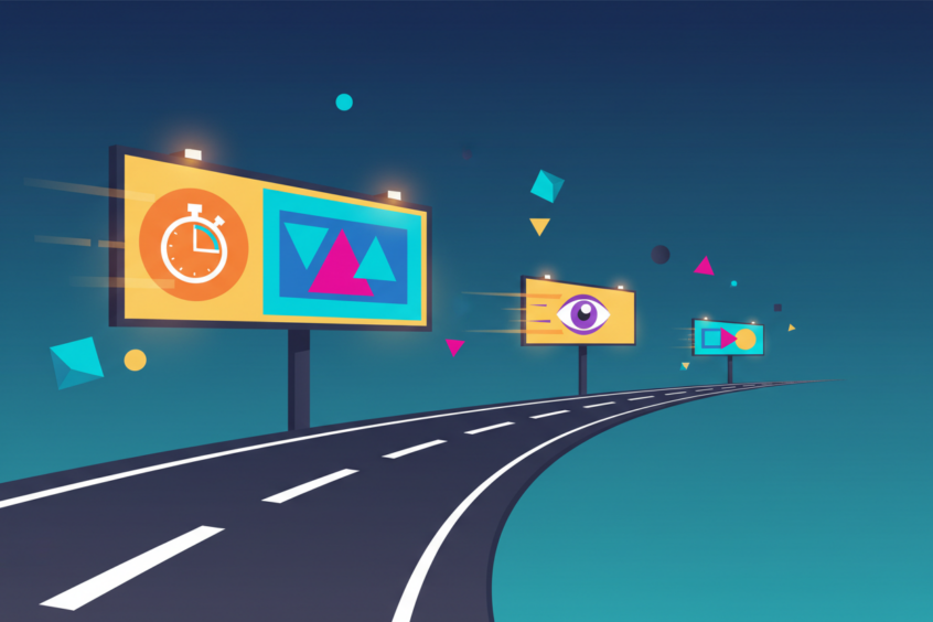
Picture this: you’re cruising down the highway at 65 miles per hour, and suddenly a billboard catches your eye. In those precious three to six seconds, that advertisement needs to grab your attention, deliver its message, and stick in your memory long after you’ve passed it. That’s the incredible challenge and art of billboard design – creating powerful visual communication that works at lightning speed.
Billboard advertising remains one of the most effective forms of outdoor marketing, reaching millions of commuters, travelers, and pedestrians daily. But here’s the thing – designing for billboards isn’t like creating a magazine ad or a social media post. It’s a completely different beast that requires understanding human psychology, visual hierarchy, and the science of split-second decision making.
The Psychology Behind Quick Visual Processing
Our brains are remarkable machines when it comes to processing visual information. Research shows that the human brain can process visual information in as little as 13 milliseconds. However, when you’re moving at highway speeds, you have roughly three to six seconds to capture someone’s attention and communicate your message effectively.
This time constraint means every element of your billboard design must work overtime. The colors you choose, the fonts you select, and the imagery you display all need to work together harmoniously to create an instant impact. Think about some of the most memorable billboards you’ve seen – chances are they followed the fundamental principle of simplicity while still managing to be incredibly compelling.
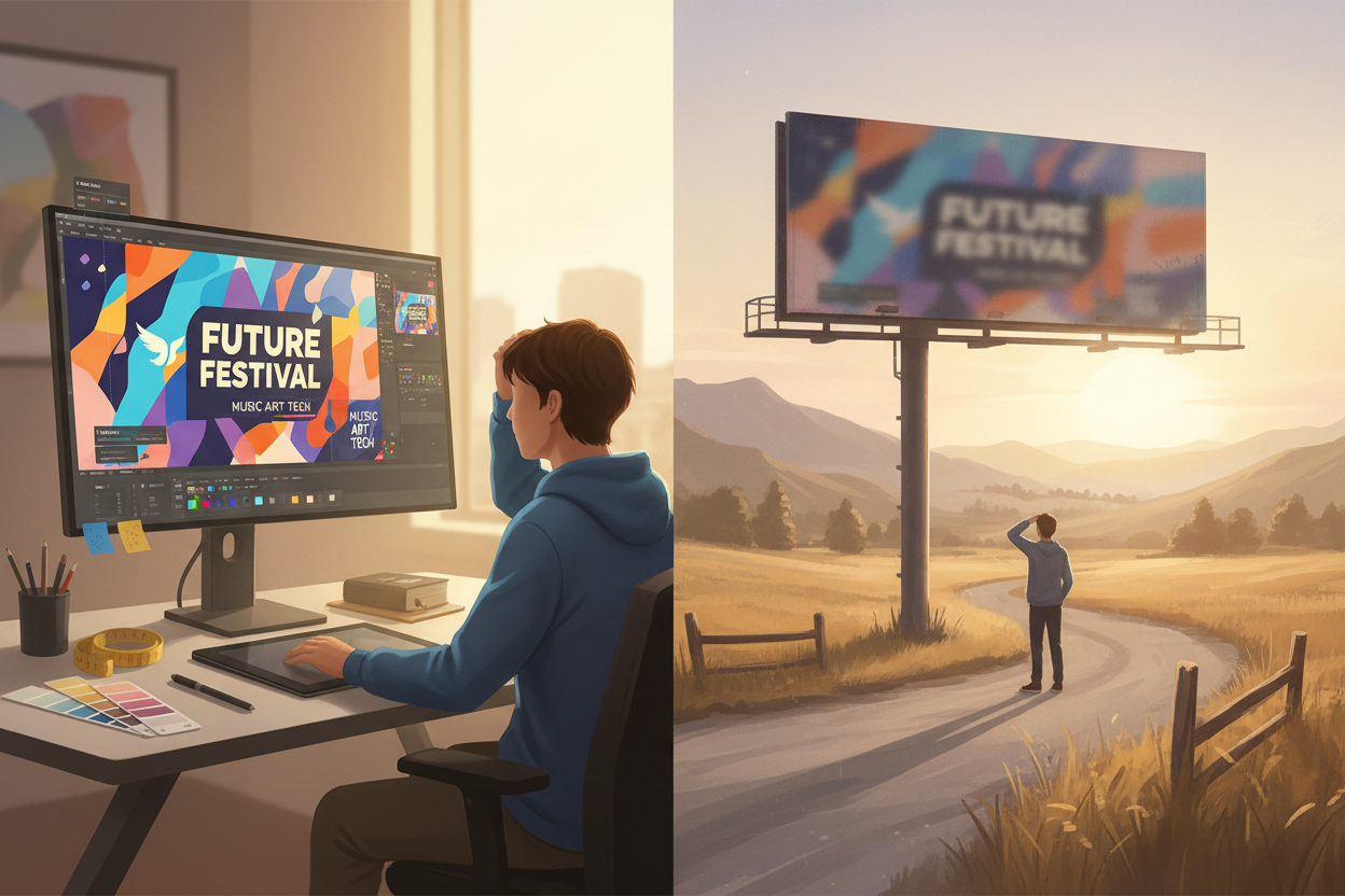
The key lies in understanding that people don’t read billboards the same way they read other forms of advertising. Instead, they scan them. Their eyes naturally follow certain patterns, typically starting from the left, moving to the right, and following a Z-shaped path across the design. Smart billboard designers leverage this natural eye movement to guide viewers through their message in the most logical sequence.
Essential Elements of Effective Billboard Design
Creating a successful billboard isn’t about cramming as much information as possible into a large space. Instead, it’s about strategic communication that respects both the medium’s limitations and its incredible potential for impact.
The most crucial element is your headline or main message. This should be the largest text on your billboard and contain no more than seven words. Why seven? Because that’s roughly the number of words the average person can process and remember in a quick glance. Your headline should be bold, clear, and immediately communicate what you’re offering or what action you want people to take.
Visual hierarchy plays a massive role in billboard effectiveness. Your design should have a clear primary element – whether that’s your headline, logo, or a striking image – that dominates the space. Secondary elements like supporting text, contact information, or additional graphics should be noticeably smaller and positioned to support, not compete with, your main message.
Color choice can make or break your billboard’s effectiveness. High contrast combinations like black text on yellow backgrounds or white text on dark blue create maximum readability at distance and speed. However, don’t just think about contrast – consider the emotional impact of your color choices. Red creates urgency and excitement, blue builds trust and reliability, while green often represents growth and harmony.
Typography That Commands Attention
When it comes to billboard typography, bigger isn’t always better – but readable always is. Your font choice needs to be legible from at least 500 feet away, which means saying goodbye to decorative scripts and overly stylized typefaces that might look beautiful up close but become illegible at distance.
Sans-serif fonts typically perform best on billboards because of their clean, simple lines. Fonts like Helvetica, Arial, or custom sans-serif typefaces provide excellent readability while maintaining a professional appearance. The key is choosing fonts with generous letter spacing and avoiding condensed typefaces that can blur together when viewed from far away.
Font weight matters tremendously in billboard design. Bold and extra-bold weights ensure your text remains visible even in challenging lighting conditions or when viewed at sharp angles. Remember, not everyone will be viewing your billboard straight-on – many people will see it from the side as they approach or pass by.
Consider the relationship between your headline and any supporting text carefully. If you include additional information like a phone number, website, or tagline, make sure there’s enough size difference between your main message and secondary information that viewers can instantly understand the hierarchy.
Strategic Use of Images and Graphics
Images on billboards need to work harder than images in any other medium. They must be instantly recognizable, emotionally compelling, and simple enough to understand at highway speeds. Complex scenes with multiple focal points will confuse viewers and dilute your message’s impact.
The most effective billboard images often feature a single, dominant subject. This could be a product shot, a person’s face, or a simple graphic illustration. Whatever you choose, make sure it’s large enough to be the hero of your design and directly relates to your message. There’s nothing worse than beautiful imagery that confuses rather than clarifies your advertising goal.
Consider the emotional story your image tells. A smiling face can create instant connection and trust. A product shot can demonstrate quality and desirability. An abstract graphic can convey innovation and creativity. But remember – subtlety doesn’t work well on billboards. Your imagery needs to communicate its message boldly and clearly.
When incorporating your logo, resist the temptation to make it huge unless brand recognition is your primary goal. Your logo should be large enough to be clearly visible and identifiable, but not so large that it overwhelms your main message. Think of your logo as the signature on your billboard letter – important, but not the main content.
The Six-Word Rule and Message Hierarchy
Professional billboard designers swear by the six-word rule: if your message can’t be communicated in six words or fewer, it’s probably too complex for billboard advertising. This doesn’t mean you can only use six words total, but your core message – the thing you most want people to remember – should be condensable into six words or less.
Think about successful billboard campaigns you remember. McDonald’s “I’m Lovin’ It” is just three words. Nike’s “Just Do It” is equally concise. Coca-Cola often uses simply “Taste the Feeling.” These messages work because they’re immediately understandable and memorable, even at high speeds.
When you do need to include additional information like contact details or locations, create a clear hierarchy. Your main message should be the largest text, followed by secondary information that’s noticeably smaller but still readable. Tertiary information like websites or phone numbers should be the smallest text on your billboard, positioned where they support but don’t interfere with your primary message.
Remember that different information serves different purposes. Your headline creates interest and communicates your main benefit. Your secondary text might provide location information or a call to action. Your contact information gives interested viewers a way to follow up later. Each element should have a clear purpose and appropriate visual weight.
Color Psychology and Visibility Factors
Color choices in billboard design go far beyond personal preference or brand guidelines – they directly impact whether your message gets seen and remembered. Certain color combinations have been proven to maximize visibility and readability at distance, while others can render even the best message nearly invisible.
High contrast is your best friend in billboard design. The classic combination of black text on a yellow background provides maximum readability in most lighting conditions. White text on dark backgrounds also performs well, particularly for nighttime visibility. However, avoid red text on green backgrounds or blue text on red backgrounds – these combinations can be difficult for colorblind viewers to distinguish.
Consider the environment where your billboard will be placed. If it’s surrounded by green trees, a green billboard might blend into the background. If it’s in an urban area with lots of red brick buildings, a red billboard might not stand out. Your color choices should help your billboard pop against its surroundings, not disappear into them.
Lighting conditions also affect color perception dramatically. Colors that look vibrant in daylight might appear washed out at dusk or under artificial lighting. If your billboard will be illuminated at night, test your color combinations under similar lighting conditions to ensure they maintain their impact after dark.
Testing and Measuring Billboard Effectiveness
The best billboard designers don’t rely on guesswork – they test their designs before committing to expensive production and placement costs. Simple testing methods can save you thousands of dollars and dramatically improve your billboard’s performance.
One effective testing method is the “glance test.” Print your billboard design at a small size and show it to people for just three seconds. Then ask them what they remember. If they can’t recall your main message or identify your brand, your design needs work. This simple test simulates the real-world conditions where your billboard will be viewed.
Distance testing is equally important. Print your design at actual size (or create a scaled version) and view it from the distance where most people will see your billboard. Can you read all the important text? Does the image remain clear and impactful? Are the colors still vibrant and contrasting? This testing phase often reveals issues that aren’t apparent when viewing designs on a computer screen.
Consider conducting focus groups with people from your target demographic. Show them several design variations and gather feedback about which versions are most memorable, persuasive, and clear. Sometimes what seems obvious to you as the designer isn’t as clear to your intended audience.
Digital vs. Traditional Billboard Considerations
The rise of digital billboards has created new opportunities and challenges for designers. Digital billboards allow for animation, multiple messages, and real-time content updates, but they also require different design approaches than traditional static billboards.
For digital billboards, you have the luxury of movement and change, but you also face the challenge of competing with other digital distractions. Your animation should enhance your message, not distract from it. Simple transitions and movements often work better than complex animations that can be difficult to follow at highway speeds.
Digital billboards also allow for multiple messages in rotation, but each individual message still needs to follow the same principles as traditional billboard design. Don’t assume that because you have multiple slides, you can include more information in each one. Each slide should be able to stand alone as an effective message.
Consider the technical limitations of digital displays as well. Colors might appear differently on LED screens than they do on your computer monitor. Text that looks crisp in your design software might appear pixelated on certain digital displays. Always preview your designs on the actual digital billboard system when possible.
Common Billboard Design Mistakes to Avoid
Even experienced designers can fall into common billboard design traps that significantly reduce effectiveness. Learning to recognize and avoid these mistakes can mean the difference between a billboard that gets results and one that gets ignored.
The most frequent mistake is trying to include too much information. Remember, billboards aren’t brochures. They’re attention-grabbing devices designed to create awareness and interest, not to communicate every detail about your product or service. If you find yourself trying to squeeze in multiple phone numbers, several bullet points, or lengthy explanations, step back and refocus on your core message.
Poor contrast is another effectiveness killer. Beautiful color combinations that work well in other mediums might not provide sufficient contrast for billboard viewing. Always test your color choices at distance and in various lighting conditions. When in doubt, err on the side of higher contrast rather than subtle sophistication.
Ignoring the viewing angle is a mistake that can render an otherwise good design ineffective. Most billboards are viewed at an angle as people approach and pass by. Text and images that look perfect when viewed straight-on might become distorted or illegible when viewed from the side. Consider how your design will look from multiple angles during the design process.
Finally, forgetting about the call to action is a missed opportunity. While not every billboard needs an explicit call to action, most should give viewers some sense of what they should do next. Whether it’s “Visit our showroom,” “Call now,” or simply “Try it today,” a clear next step helps convert billboard viewers into customers.
Conclusion
Effective billboard design is both an art and a science, requiring creativity balanced with strategic thinking about human psychology and visual communication. The challenge of creating messages for quick consumption pushes designers to distill complex ideas into their most essential elements, resulting in communication that’s not just effective, but often elegantly simple.
Remember that your billboard competes not just with other advertisements, but with everything else in the visual environment – from road signs to natural scenery to the countless distractions of modern life. Your design needs to be bold enough to break through this visual noise while remaining clear and memorable enough to stick with viewers long after they’ve driven past.
The most successful billboard campaigns understand that less is almost always more. They focus on a single, powerful message delivered through bold typography, striking imagery, and strategic color choices. They respect the medium’s limitations while leveraging its unique strengths – the ability to reach massive audiences with consistent, repeated exposure to your message.
Whether you’re designing your first billboard or your hundredth, never forget that you have just a few seconds to make a lasting impression. Make those seconds count by crafting messages that are impossible to ignore and impossible to forget. In the fast-paced world of highway advertising, simplicity, clarity, and boldness aren’t just design principles – they’re the keys to success.
No More BS – Get a FREE Consultation
No more BS. Let’s talk real world $#!+ about what you need. You’ll meet with our top dog, and you’ll leave with a better understanding of what you need to do, and how RyCOM might help.