
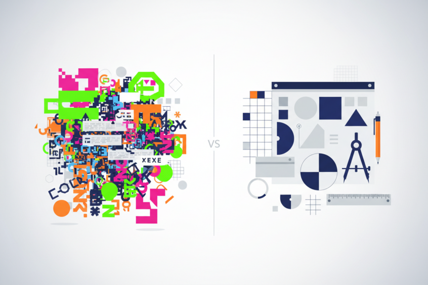
Common Logo Design Mistakes and How to Avoid Them: A Designer’s Guide to Creating Memorable Brands
Your logo is often the first impression customers have of your brand, making it one of the most critical elements of your business identity. Yet, surprisingly, many businesses fall into predictable traps when designing their logos. Whether you’re a startup founder working on your first brand identity or an established business considering a rebrand, understanding these common logo design mistakes can save you time, money, and potentially damaging brand confusion.
After working with hundreds of clients over the years, I’ve seen the same design pitfalls repeated again and again. The good news? Most of these mistakes are entirely preventable with the right knowledge and approach. Let’s dive into the most frequent logo design errors and explore practical solutions that will help you create a logo that truly represents your brand’s essence.
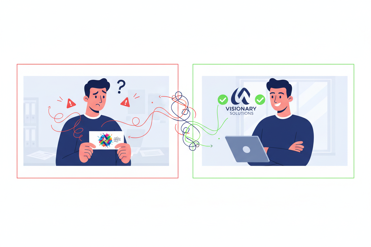
Following Trends Instead of Building Timeless Design
One of the biggest mistakes I encounter is businesses chasing the latest design trends instead of focusing on creating something timeless. While that gradient effect or trendy font might look cutting-edge today, will it still represent your brand effectively in five or ten years?
Trends come and go with lightning speed in the digital age. Remember when every tech company had a glossy, 3D logo? Or when minimalist geometric shapes dominated every industry? These trends felt fresh and modern at the time, but many companies that followed them religiously found themselves looking dated within just a few years.

The solution lies in understanding the difference between being contemporary and being trendy. A well-designed logo should feel current without being tied to a specific moment in design history. Look at brands like Coca-Cola, Nike, or Apple – their logos have remained largely unchanged for decades because they focused on timeless principles rather than fleeting trends.
When designing your logo, ask yourself: “Will this design still make sense for my brand in 2030?” If you’re unsure, it might be worth reconsidering your approach and focusing on more enduring design elements.
Overcomplicating the Design Elements
Complexity is the enemy of memorable logo design. I’ve worked with clients who wanted to include every aspect of their business in their logo – their location, their services, their company values, and their industry symbols. The result? A cluttered mess that fails to communicate anything effectively.
Think about the most recognizable logos in the world. McDonald’s golden arches don’t depict a burger or fries. Nike’s swoosh doesn’t show a running shoe. Apple’s logo isn’t a computer. These brands understood that a logo’s job isn’t to literally represent what you do – it’s to be a distinctive mark that people associate with your brand experience.
Overcomplication manifests in several ways: too many colors, excessive text, multiple symbols, or intricate illustrations that lose clarity when scaled down. Remember, your logo needs to work across various applications – from business cards to billboards, from social media avatars to embroidered shirts.
The fix is surprisingly simple: embrace simplicity. Start with your core brand message and find one strong visual element that can represent it. Strip away everything non-essential. If you can remove an element without losing the logo’s impact, remove it. Your future self will thank you when your logo remains clear and recognizable across all applications.
Ignoring Scalability and Versatility Requirements
This mistake hits businesses hard when they start applying their logo across different mediums. A logo that looks stunning on your computer screen might become an illegible blur when printed on a business card or displayed as a social media profile picture.
Modern logos need to work everywhere – from massive highway billboards to tiny mobile app icons. This means your design must maintain its integrity and recognizability at any size. Thin lines, small text, and intricate details are the first casualties when a logo is scaled down.
I always recommend the “favicon test” to my clients. Can your logo be recognized when reduced to a 16×16 pixel favicon? If not, it’s probably too complex for today’s multi-platform world. Similarly, your logo should work in black and white, ensuring it remains effective in single-color applications like newspaper ads, stamps, or embossed materials.
The solution involves designing with scalability in mind from the very beginning. Create bold, simple shapes that maintain their impact at small sizes. Avoid fine details that disappear when reduced. Test your logo at various sizes throughout the design process, not just at the end. Consider creating simplified versions of your logo for specific applications – many successful brands have multiple logo variations for different use cases.
Poor Color Choice and Psychology
Color psychology plays a massive role in how people perceive your brand, yet many businesses choose colors based on personal preference rather than strategic thinking. I’ve seen restaurants use colors that suppress appetite, financial services use colors that suggest instability, and healthcare brands use colors that create anxiety rather than trust.
Different colors evoke different emotional responses and carry cultural associations. Blue suggests trust and professionalism, which is why it’s popular in finance and technology. Green implies growth and nature, making it perfect for environmental or health-focused brands. Red creates urgency and excitement, explaining its prevalence in food and entertainment industries.
However, color choice goes beyond psychology. Practical considerations matter too. Will your chosen colors reproduce well in print? Do they work across different lighting conditions? Can you afford the printing costs if your logo requires multiple special colors?
The key is balancing emotional impact with practical application. Research color associations within your industry, but don’t be afraid to stand out if it makes strategic sense. Always test your colors across different mediums and lighting conditions. Consider creating a color palette that includes primary and secondary colors, giving you flexibility while maintaining consistency.
Typography Mistakes That Undermine Brand Identity
Typography can make or break a logo, yet it’s often treated as an afterthought. Common mistakes include choosing fonts that don’t match the brand personality, using too many different typefaces, or selecting fonts that don’t reproduce well at small sizes.
I’ve seen law firms use playful, childish fonts that undermine their credibility, and children’s brands use serious, corporate typefaces that feel cold and uninviting. The disconnect between font choice and brand personality creates confusion and weakens the overall brand message.
Another frequent error is using trendy fonts that quickly become dated. That script font that feels elegant today might look cliched tomorrow. Similarly, using fonts that everyone else in your industry uses makes you blend in rather than stand out.
Technical issues also plague typography choices. Some fonts don’t scale well, becoming illegible at small sizes. Others don’t reproduce consistently across different platforms and devices. Custom lettering might look unique but can create problems if you need to type your company name in matching fonts for other materials.
The solution starts with understanding your brand personality and choosing typography that reinforces it. A tech startup might benefit from clean, modern sans-serif fonts, while a luxury brand might choose elegant serif typefaces. Always test your typography at various sizes and across different applications. Consider readability over novelty, and ensure your chosen fonts are widely available or properly licensed for all your needs.
Lack of Research and Brand Strategy
Perhaps the most fundamental mistake is jumping into logo design without proper research and strategy. Many businesses start designing before they understand their target audience, competitive landscape, or brand positioning. This backwards approach often leads to logos that miss the mark entirely.
Effective logo design begins with understanding who you’re trying to reach and how you want to be perceived. A logo targeting millennials will look different from one aimed at baby boomers. A logo for a local service business has different requirements than one for a global corporation.
Competitive research is equally important. You need to understand what others in your space are doing – not to copy them, but to ensure you stand out. If every competitor uses blue and geometric shapes, maybe your brand should explore different directions.
The fix requires patience and planning. Start with a comprehensive brand strategy that defines your target audience, brand personality, competitive positioning, and key messages. Research your competitors thoroughly, noting both what works and what doesn’t. Survey your target audience to understand their preferences and associations. Only after this groundwork should you begin the actual design process.
Creating Your Logo Success Strategy
Avoiding these common logo design mistakes requires a strategic approach that prioritizes long-term brand building over short-term trends. The most successful logos result from careful planning, thorough research, and a deep understanding of both the brand and its audience.
Remember that your logo is an investment in your brand’s future. Taking shortcuts or rushing the process often leads to costly rebrands down the road. Whether you’re working with a professional designer or tackling the project yourself, focus on creating something that will serve your brand well for years to come.
The best logos feel inevitable – as if they couldn’t be any other way. They perfectly capture the essence of the brand while remaining flexible enough to grow with the business. By avoiding these common pitfalls and focusing on timeless design principles, you’ll create a logo that not only looks great today but continues to serve your brand effectively for years to come.
Your logo is more than just a pretty picture – it’s a powerful tool for building brand recognition and trust. Invest the time and thought it deserves, and you’ll have a visual identity that truly supports your business goals and connects with your audience on a meaningful level.
No More BS – Get a FREE Consultation
No more BS. Let’s talk real world $#!+ about what you need. You’ll meet with our top dog, and you’ll leave with a better understanding of what you need to do, and how RyCOM might help.