
Direct Mail Design: How to Craft a Piece That Gets Opened
In today’s digital-first world, you might think direct mail has gone the way of the dinosaur. But here’s the thing – it hasn’t. In fact, direct mail marketing continues to deliver impressive results, with response rates that often outperform digital channels. The catch? Your piece actually has to get opened first.
I’ve spent years helping businesses crack the code on direct mail design, and I can tell you that the difference between a piece that gets tossed and one that gets opened often comes down to just a few crucial design elements. Whether you’re a small business owner looking to boost your local presence or a marketing professional tasked with improving campaign performance, understanding these principles can transform your direct mail success.
Let’s dive into the art and science of creating direct mail pieces that recipients can’t help but open.
The Psychology Behind Direct Mail Opening Behavior
Before we jump into design specifics, it’s essential to understand what happens in those critical three seconds when someone encounters your mail piece. Research shows that recipients make snap decisions about whether to engage with direct mail based on immediate visual cues and emotional responses.
The human brain is wired to seek novelty and avoid perceived threats or spam. Your direct mail piece is competing not just with other marketing materials, but with bills, personal correspondence, and the general mental fatigue that comes with sorting through mail. This means your design needs to quickly communicate value, credibility, and relevance.
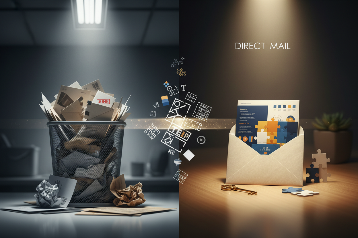
Think about your own behavior when sorting mail. You’re probably standing over a trash can, quickly categorizing pieces into “keep,” “maybe,” and “toss” piles. The pieces that make it to the “keep” pile share certain characteristics – they look important, valuable, or intriguing enough to warrant a closer look.
Essential Elements of High-Converting Direct Mail Design
Creating a direct mail piece that consistently gets opened requires attention to several key design elements. Each component works together to create an overall impression that encourages engagement rather than disposal.
The envelope or outer packaging serves as your first and most important impression. It’s the gatekeeper that determines whether your carefully crafted message inside ever sees the light of day. Every design choice you make here should support the goal of getting that piece opened.
Color psychology plays a significant role in direct mail success. Certain colors evoke specific emotional responses and can influence decision-making. However, the key isn’t just choosing the “right” colors, but choosing colors that align with your message and stand out appropriately in the mailbox environment.
Envelope Design Strategies That Drive Opens
Your envelope design is where the magic happens – or where campaigns go to die. I’ve seen beautifully designed interior pieces that never got a chance because the envelope failed to capture attention or, worse, looked like obvious junk mail.
Size matters more than you might think. While standard business envelopes are cost-effective, they also blend into the sea of bills and routine correspondence. Oversized envelopes, square formats, or unique dimensions immediately signal that your piece is different. However, bigger isn’t always better – sometimes a smaller, premium-feeling piece can be more intriguing than a large, obviously promotional mailer.
The return address area offers prime real estate for building credibility and interest. Instead of just listing your company name, consider using language that hints at the value inside. A return address that reads “Your Neighborhood Home Value Report” is more compelling than “ABC Real Estate Company.”
Teaser text on the envelope can be incredibly effective when done right. The key is creating curiosity without giving away everything. Think of it like a movie trailer – you want to generate interest and anticipation, not tell the whole story. Phrases like “Time-sensitive information enclosed” or “Your exclusive invitation inside” can work, but avoid overused terms like “Important” or “Urgent” that immediately signal marketing mail.
Typography and Visual Hierarchy for Maximum Impact
Typography in direct mail serves a dual purpose: it needs to be readable and it needs to guide the recipient’s eye through your message in a logical sequence. Poor typography can kill even the most compelling offer, while great typography can elevate an average message.
Font choice communicates personality and credibility before your message is even read. Sans-serif fonts like Helvetica or Arial convey modernity and clarity, while serif fonts like Times New Roman suggest tradition and authority. Script fonts can add elegance but should be used sparingly and only when highly legible.
Size hierarchy is crucial for guiding attention. Your most important message – usually your main benefit or offer – should be the largest text element. Secondary information should be noticeably smaller but still easily readable. Avoid the common mistake of making everything large and bold; this creates visual chaos rather than clear communication.
White space, often called negative space, is just as important as the text and images you include. Adequate white space makes your piece feel premium and allows the recipient’s eye to rest. Cramming too much information into your design not only looks unprofessional but also makes it harder for recipients to process your message quickly.
Color Psychology in Direct Mail Marketing
Color choices in direct mail design go far beyond personal preference or brand guidelines. Different colors trigger different psychological responses and can significantly impact how recipients perceive and respond to your message.
Red is often associated with urgency and excitement, making it effective for limited-time offers or calls-to-action. However, too much red can feel aggressive or alarming. Blue conveys trust and stability, which is why it’s popular in financial services marketing. Green suggests growth, money, or environmental consciousness, depending on the context.
The key to effective color use in direct mail is contrast and appropriateness. Your colors need to work together to create a cohesive design while ensuring important elements stand out. A bright yellow call-to-action button on a dark blue background will grab attention, while yellow text on a white background will be nearly invisible.
Consider your target audience when making color choices. Colors that appeal to young adults might not resonate with seniors, and cultural associations with colors can vary significantly. What feels fresh and modern to one demographic might seem unprofessional to another.
Personalization Techniques That Increase Open Rates
Personalization in direct mail has evolved far beyond simply including the recipient’s name. Today’s most effective direct mail pieces use data to create genuinely relevant and personalized experiences that feel custom-created for each recipient.
Variable data printing allows you to customize not just text, but images, offers, and entire design elements based on recipient data. A real estate company might include a photo of the recipient’s neighborhood, while a retailer could feature products based on past purchase history.
Geographic personalization can be particularly powerful. References to local landmarks, weather patterns, or community events immediately establish relevance and connection. A piece that mentions “your neighbors on Maple Street” feels much more personal than generic messaging.
Behavioral personalization uses past interactions or purchase history to tailor messaging. If you know a customer previously bought winter gear, a spring promotion for hiking equipment is more relevant than a random product offering. This type of personalization requires good data management but can dramatically improve response rates.
Testing and Optimization for Better Results
The most successful direct mail campaigns are built on continuous testing and optimization. What works for one audience or offer might not work for another, and market conditions change over time. Regular testing helps you refine your approach and improve results consistently.
A/B testing different envelope designs is one of the most impactful tests you can run. Try different colors, sizes, teaser text, or return address formats with small test groups before rolling out to your full list. Even small improvements in open rates can significantly impact overall campaign ROI.
Test timing as well as design. The day of the week and time of month your mail arrives can affect open rates. Mail that arrives on Tuesday might get more attention than mail that arrives on Friday when people are focused on weekend plans.
Keep detailed records of what works and what doesn’t. Create a library of successful design elements, color combinations, and messaging approaches that you can reference for future campaigns. This institutional knowledge becomes increasingly valuable as you build more campaigns.
Common Direct Mail Design Mistakes to Avoid
Even experienced marketers can fall into common direct mail design traps that hurt open rates and response. Being aware of these pitfalls can help you avoid costly mistakes and improve your campaign performance.
The biggest mistake I see is making pieces look too much like obvious marketing mail. While you want your piece to stand out, it shouldn’t scream “advertisement” from across the room. Subtle design cues that suggest value and relevance work better than flashy, over-the-top promotional designs.
Another common error is inconsistent branding between the envelope and interior content. If your envelope suggests a personal letter but the inside is clearly a promotional flyer, you’ve broken trust with the recipient. Ensure your design creates appropriate expectations that your content can fulfill.
Overcomplicating the design is also problematic. Multiple fonts, too many colors, competing visual elements, and cluttered layouts confuse rather than convince. Remember that recipients are making quick decisions – your design should support fast comprehension, not hinder it.
Measuring Success and Improving Future Campaigns
Creating great direct mail design is an iterative process that improves with measurement and analysis. Tracking the right metrics helps you understand what’s working and where you can improve future campaigns.
Open rates are your primary metric for envelope design success, but they’re not always easy to measure directly. You can estimate open rates by tracking response rates and conducting periodic surveys or focus groups. If you’re seeing low response rates despite strong offers, envelope design is often the culprit.
Response rates tell you about the effectiveness of your entire piece, from envelope to call-to-action. Significant differences in response rates between similar campaigns often point to design elements that are helping or hurting performance.
Qualitative feedback can be just as valuable as quantitative data. Ask customers how they heard about your offer or what caught their attention about your mailer. This feedback often reveals insights that numbers alone can’t provide.
Direct mail design that gets opened isn’t about following a rigid formula – it’s about understanding your audience, creating relevant value, and presenting it in a way that stands out for the right reasons. The most successful direct mail pieces feel like they were created specifically for the recipient, addressing their needs and interests in a visually appealing and professional manner.
Remember that great direct mail design is just the beginning. Once you’ve earned the open, your content needs to deliver on the promise your design has made. But without that initial open, even the most compelling offer will never see the light of day. Invest the time and effort in crafting envelope designs that capture attention, build interest, and create the desire to learn more – your campaign results will thank you for it.
No More BS – Get a FREE Consultation
No more BS. Let’s talk real world $#!+ about what you need. You’ll meet with our top dog, and you’ll leave with a better understanding of what you need to do, and how RyCOM might help.