

Direct Mail Design: Strategies for Impactful Communication
In our digital-first world, you might think traditional direct mail has lost its punch. But here’s the thing – it hasn’t. In fact, direct mail marketing continues to deliver impressive results, with response rates that often outperform digital channels. The secret sauce? Strategic design that cuts through the noise and creates genuine connections with your audience.
Whether you’re a seasoned marketer looking to refresh your approach or a business owner considering your first direct mail campaign, understanding the fundamentals of effective direct mail design can transform your marketing efforts. Let’s dive into the strategies that make direct mail pieces impossible to ignore.
Understanding Your Audience: The Foundation of Effective Direct Mail Design
Before you even think about colors, fonts, or layouts, you need to understand who you’re talking to. Your direct mail design should speak directly to your target audience’s needs, preferences, and pain points. This isn’t just about demographics – it’s about understanding their lifestyle, challenges, and what motivates them to take action.
Start by creating detailed buyer personas for your campaign. Consider factors like age, income level, geographic location, and purchasing behavior. A direct mail piece targeting busy professionals will look vastly different from one aimed at retirees or young families. The design elements that resonate with a tech-savvy millennial won’t necessarily appeal to a traditional baby boomer.
Research shows that personalized direct mail generates response rates up to 36 times higher than non-personalized pieces. This goes beyond just including the recipient’s name – it’s about tailoring the entire visual experience to match their preferences and expectations.
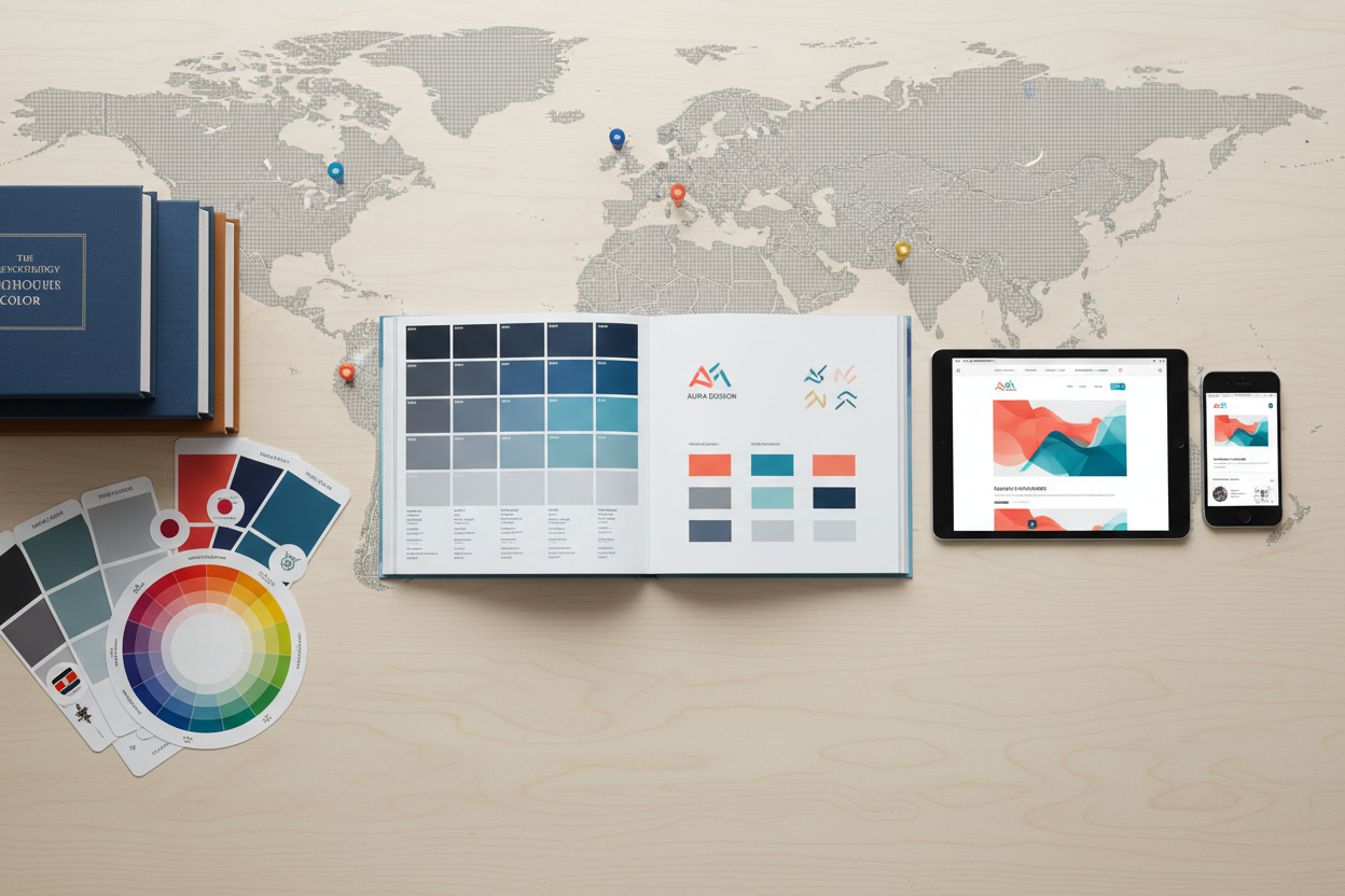
The Psychology of Color in Direct Mail Marketing
Color isn’t just about making your direct mail piece look pretty – it’s a powerful psychological tool that can influence emotions, create associations, and drive action. Understanding color psychology can significantly impact your campaign’s success rate.
Red creates urgency and excitement, making it perfect for limited-time offers or sales announcements. Blue builds trust and reliability, which is why many financial institutions and healthcare providers use it prominently. Green suggests growth, health, and prosperity, while orange conveys enthusiasm and creativity.
However, don’t just pick colors based on general psychology principles. Consider your brand identity and how colors will work together in your overall design. A cohesive color palette that aligns with your brand helps build recognition and trust. Remember that different cultures may interpret colors differently, so consider your geographic market when making color choices.
The contrast between your background and text colors is crucial for readability. Poor color contrast can make your message illegible, regardless of how compelling your content might be. Always test your color combinations to ensure they work well in both print and various lighting conditions.
Typography That Commands Attention
Your font choices can make or break your direct mail campaign. Typography isn’t just about readability – it’s about conveying personality, establishing hierarchy, and guiding the reader’s eye through your message.
Start with a clear hierarchy using different font sizes and weights. Your headline should be the largest and most prominent text element, followed by subheadings, body text, and call-to-action buttons. This creates a natural reading flow that guides recipients through your message logically.
Limit yourself to two or three font families maximum. Using too many different fonts creates visual chaos and can make your piece look unprofessional. Choose fonts that complement each other and align with your brand personality. A playful, rounded font might work well for a children’s product, while a clean, modern sans-serif font might be better for a technology company.
Pay special attention to your call-to-action text. This is often the most important element on your direct mail piece, so it needs to stand out. Use bold, contrasting colors and ensure the font is large enough to read quickly. Action words like “Call Now,” “Save Today,” or “Get Started” should be immediately visible.
Layout and Visual Hierarchy: Guiding the Reader’s Journey
Effective direct mail design creates a clear visual path that leads the reader from initial attention through to action. This requires strategic thinking about layout and visual hierarchy.
The Z-pattern and F-pattern are two common reading patterns that can inform your layout decisions. The Z-pattern works well for simpler designs where the eye moves from top-left to top-right, then diagonally down to bottom-left, and finally across to bottom-right. The F-pattern is more suitable for text-heavy pieces, where readers scan the top, then move down the left side, occasionally scanning right for interesting information.
White space, or negative space, is your friend. It gives your design room to breathe and helps important elements stand out. Don’t feel compelled to fill every inch of your mail piece with content. Strategic use of white space can actually make your message more impactful by reducing visual clutter.
Consider the fold if you’re using a multi-panel format. The most important information should be visible before the recipient unfolds or opens your piece. Think of the front panel as your book cover – it needs to entice people to look inside.
The Power of Compelling Headlines and Copy
Your headline is often the first thing recipients see, and it determines whether they’ll continue reading or toss your piece in the trash. A compelling headline should be clear, benefit-focused, and create curiosity or urgency.
Avoid generic headlines like “Great Deals Inside” or “Special Offer.” Instead, focus on specific benefits that matter to your audience. “Save $500 on Your Energy Bills This Winter” is much more compelling than “Energy Savings Available.” The more specific and relevant your headline, the more likely it is to capture attention.
Your body copy should support and expand on your headline’s promise. Keep sentences and paragraphs short for easy scanning. Use bullet points to highlight key benefits or features. Remember that most people will scan rather than read every word, so make your key points easy to find.
Include social proof elements like testimonials, reviews, or statistics. These build credibility and help overcome skepticism. A brief customer testimonial or a statistic like “Join over 10,000 satisfied customers” can significantly boost response rates.
Strategic Use of Images and Graphics
Images can convey emotion and information faster than text, making them crucial elements in direct mail design. However, not all images are created equal. Your image choices should support your message and appeal to your target audience.
High-quality, professional images are non-negotiable. Blurry or pixelated images immediately signal low quality and can damage your brand’s credibility. If you’re featuring products, ensure the images are clear, well-lit, and show the product from the most appealing angle.
People connect with faces, so consider including images of real customers or team members rather than generic stock photos. Authentic images of people using your product or service can be much more persuasive than perfectly staged stock photography.
Infographics and charts can be powerful tools for presenting complex information in an easily digestible format. If you’re sharing statistics, comparisons, or step-by-step processes, visual representations often work better than paragraphs of text.
Remember to optimize your images for print. Colors may appear differently in print than on screen, so always request print proofs to ensure your images look as intended in the final product.
Creating Irresistible Calls-to-Action
Your call-to-action is where interest converts to action, making it one of the most critical elements of your direct mail design. A weak or unclear call-to-action can undermine an otherwise excellent campaign.
Make your call-to-action specific and time-sensitive. Instead of “Contact us,” try “Call now to schedule your free consultation” or “Visit our website by Friday to claim your discount.” Specific actions with clear deadlines create urgency and make it easier for recipients to know exactly what to do next.
Provide multiple response options to accommodate different preferences. Some people prefer to call, others like to visit websites, and some might want to visit a physical location. Include phone numbers, websites, QR codes, and physical addresses as appropriate for your campaign.
QR codes have made a comeback and can bridge the gap between physical mail and digital experiences. They’re particularly effective for driving traffic to specific landing pages, promotional videos, or special offers. Make sure your QR code is large enough to scan easily and test it thoroughly before printing.
Testing and Optimization for Maximum Impact
Even the most thoughtfully designed direct mail piece can be improved through testing and optimization. A/B testing different design elements can provide valuable insights into what resonates best with your audience.
Test one element at a time to get clear results. You might test different headlines, color schemes, images, or call-to-action buttons. Keep everything else constant so you can attribute any performance differences to the specific element you’re testing.
Track response rates, conversion rates, and return on investment for each variation. This data will inform future campaigns and help you build a library of proven design elements that work for your audience.
Don’t forget to test your mail pieces in real-world conditions. Print a few samples and review them in different lighting conditions. Check how they look when they arrive in actual mailboxes, potentially mixed with other mail pieces.
Measuring Success and Continuous Improvement
Successful direct mail design is an ongoing process of refinement and improvement. Establish clear metrics for success before launching your campaign, and use these benchmarks to evaluate performance and identify areas for enhancement.
Response rates are important, but don’t stop there. Track conversion rates, average order values, and customer lifetime value to get a complete picture of your campaign’s effectiveness. A campaign with a lower response rate might still be more profitable if it attracts higher-value customers.
Collect feedback from respondents when possible. Simple surveys or feedback forms can provide insights into what motivated them to respond and what elements of your design were most compelling.
Keep detailed records of what works and what doesn’t. Build a reference library of successful design elements, color combinations, headlines, and layouts that you can reference and adapt for future campaigns.
Direct mail design is both an art and a science, requiring creativity balanced with strategic thinking and data-driven decision making. By focusing on your audience’s needs, using design elements strategically, and continuously testing and refining your approach, you can create direct mail pieces that not only capture attention but drive meaningful results for your business. Remember, the best direct mail designs don’t just look good – they communicate effectively and inspire action.
No More BS – Get a FREE Consultation
No more BS. Let’s talk real world $#!+ about what you need. You’ll meet with our top dog, and you’ll leave with a better understanding of what you need to do, and how RyCOM might help.