
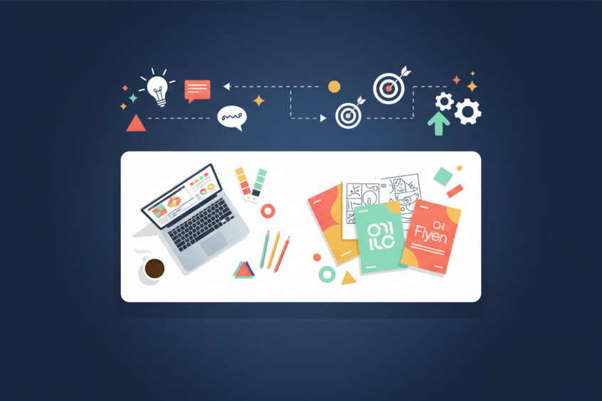
Effective Flyer Design: Combining Creativity with Strategic Messaging
In today’s digital-first world, you might think traditional marketing materials like flyers have lost their punch. But here’s the thing – a well-designed flyer can still stop people in their tracks and drive real results for your business. I’ve seen countless businesses underestimate the power of effective flyer design, treating it as an afterthought rather than a strategic marketing tool.
The secret sauce? It’s not just about making something that looks pretty. The most successful flyers masterfully blend eye-catching creativity with laser-focused strategic messaging. When you get this combination right, your flyer becomes a powerful conversion machine that cuts through the noise and compels people to take action.
Whether you’re promoting a grand opening, advertising a special event, or launching a new service, understanding how to balance visual appeal with persuasive messaging can make the difference between a flyer that gets tossed in the trash and one that drives customers through your door.
Understanding Your Target Audience for Flyer Success
Before you even think about colors, fonts, or layouts, you need to get crystal clear on who you’re trying to reach. This isn’t just marketing 101 – it’s the foundation that everything else builds upon. Your flyer design and messaging should speak directly to your ideal customer’s needs, preferences, and pain points.
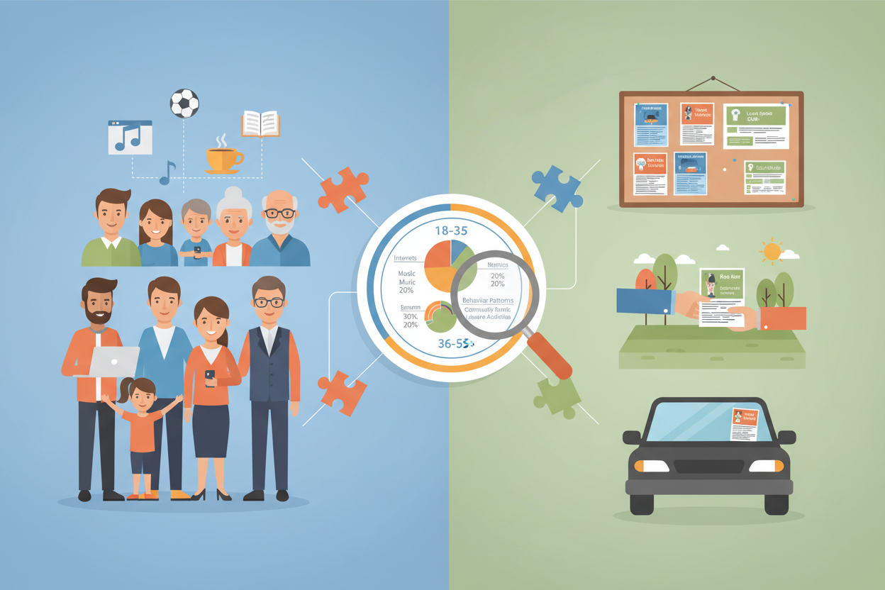
Start by creating a detailed picture of your target audience. What age group are they in? What are their interests and hobbies? Where do they typically see flyers – on community bulletin boards, handed out at events, or tucked under windshield wipers? Understanding these details helps you make informed decisions about everything from color psychology to the complexity of your message.
For instance, if you’re targeting busy parents for a children’s activity program, your flyer needs to communicate value quickly and clearly. These folks are scanning, not reading every word. On the other hand, if you’re promoting a technical workshop for professionals, you can include more detailed information because your audience expects and wants those specifics.
The language you use should also reflect your audience’s communication style. A flyer for a trendy coffee shop might use casual, conversational language, while one for a financial planning service should maintain a more professional tone. This alignment between audience and messaging creates an immediate connection that makes people more likely to engage with your content.
Visual Design Elements That Capture Attention
Now comes the fun part – creating a visual design that stops people mid-scroll or mid-step. The goal is to create what designers call “visual hierarchy,” which guides the reader’s eye through your flyer in a logical sequence. You want them to see your headline first, then your key benefits, and finally your call to action.
Color choice plays a huge role in this process. Different colors evoke different emotions and associations. Red creates urgency and excitement – perfect for sales or limited-time offers. Blue builds trust and professionalism, making it ideal for service-based businesses. Green suggests growth and health, which works well for wellness or environmental services. Don’t just pick colors you like; choose colors that support your message and appeal to your target audience.
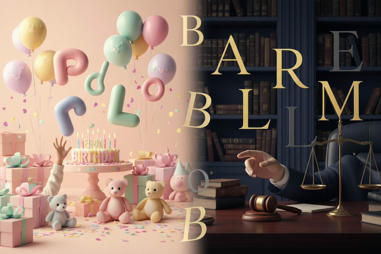
Typography is another powerful tool that many people overlook. Your font choices should reflect your brand personality while maintaining readability. A playful, rounded font might work perfectly for a children’s event but would feel inappropriate for a law firm. Stick to no more than two or three font families, and make sure there’s enough contrast between your text and background colors.
White space – or negative space – is your secret weapon for creating a clean, professional look. Many people make the mistake of trying to cram too much information onto their flyer, but white space actually makes your key messages more impactful. It gives the eye a place to rest and makes your flyer feel less cluttered and overwhelming.
Crafting Compelling Headlines and Key Messages
Your headline is the make-or-break moment for your flyer. You have about three seconds to grab someone’s attention and convince them to keep reading. This means your headline needs to be clear, compelling, and focused on the benefit to your reader – not just what you’re offering.
Instead of “New Restaurant Opening,” try “Finally! Authentic Italian Cuisine Comes to Downtown.” The second headline creates curiosity and suggests that people have been waiting for this. It’s specific about what type of food and gives a location, helping the right people immediately identify whether this is relevant to them.
Your supporting messages should follow the same principle. Focus on benefits rather than features. Don’t just list what you do; explain how it improves your customer’s life. If you’re a house cleaning service, don’t just say “We clean houses.” Say “Get Your Weekends Back – Professional House Cleaning That Fits Your Schedule.”
Keep your language simple and conversational. Avoid industry jargon unless you’re specifically targeting people who would understand and expect it. Remember, people are scanning, not studying your flyer. Use bullet points, short sentences, and clear, action-oriented language that makes it easy for them to quickly understand your value proposition.
Strategic Layout and Information Hierarchy
The way you organize information on your flyer can dramatically impact its effectiveness. Think of your flyer as a story that unfolds as the reader’s eye moves across the page. You want to guide them through this story in a way that builds interest and leads naturally to your call to action.
Most effective flyers follow a Z-pattern or F-pattern layout, which aligns with how people naturally scan content. Start with your headline at the top, include your key benefit or offer in the middle, and place your call to action at the bottom right – the natural ending point of the Z-pattern.
Size matters when it comes to information hierarchy. Your most important elements should be the largest, with supporting information getting progressively smaller. This doesn’t mean everything else should be tiny, but there should be a clear visual distinction between your headline, subheadings, body text, and call to action.
Consider using visual elements like arrows, borders, or icons to guide the eye and break up text. These elements can help create a logical flow and make your flyer more visually interesting. Just make sure they support your message rather than distract from it.
Call-to-Action Strategies That Drive Results
Here’s where many flyers fall flat – they create interest but fail to tell people exactly what to do next. Your call to action should be specific, urgent, and easy to follow. Instead of “Contact us for more information,” try “Call now to reserve your spot – only 20 spaces available.”
Make your contact information impossible to miss. Use a larger font size, bold text, or a contrasting background color. Include multiple ways for people to reach you – phone number, website, email, or social media handles. Different people prefer different communication methods, so give them options.
Creating urgency can significantly boost response rates, but it needs to be genuine. Limited-time offers, early bird pricing, or limited quantities work well if they’re truthful. People can sense fake urgency, and it can damage your credibility.
Consider including a special offer or incentive that’s exclusive to your flyer. This could be a discount code, a free consultation, or a bonus service. This not only encourages immediate action but also helps you track the effectiveness of your flyer campaign.
Testing and Measuring Flyer Performance
One of the biggest advantages of flyer marketing is that it’s relatively inexpensive to test different approaches. Create two or three versions of your flyer with different headlines, offers, or designs, and distribute them to similar audiences. Track which version generates more responses to understand what resonates best with your target market.
Use unique tracking methods for each flyer version. This could be different phone numbers, specific promo codes, or unique landing pages on your website. This data helps you understand not just how many people responded, but which elements of your design and messaging were most effective.
Pay attention to where and how you distribute your flyers, as this can impact performance as much as the design itself. Track response rates from different locations and distribution methods. You might find that flyers placed in coffee shops generate more leads than those handed out on street corners, or vice versa.
Don’t forget to ask new customers how they heard about you. This simple question can provide valuable insights into which marketing efforts are working and help you allocate your marketing budget more effectively in the future.
Conclusion
Creating an effective flyer isn’t about choosing between creativity and strategy – it’s about weaving them together into a cohesive marketing tool that speaks directly to your target audience. When you combine eye-catching visual design with clear, benefit-focused messaging and a compelling call to action, you create something that can compete with any digital marketing channel.
Remember that great flyer design is an iterative process. Your first version probably won’t be perfect, and that’s okay. Use the feedback and results from each campaign to refine your approach. Pay attention to what works, what doesn’t, and what your audience responds to most enthusiastically.
The businesses that succeed with flyer marketing are those that treat it as a strategic marketing channel rather than a quick afterthought. They invest time in understanding their audience, crafting compelling messages, and creating designs that support their business goals. With the right approach, your flyers can become powerful tools for building brand awareness, driving traffic, and generating sales.
So the next time you’re planning a flyer campaign, remember that creativity and strategy aren’t opposing forces – they’re partners in creating marketing materials that truly connect with your audience and drive real business results.
No More BS – Get a FREE Consultation
No more BS. Let’s talk real world $#!+ about what you need. You’ll meet with our top dog, and you’ll leave with a better understanding of what you need to do, and how RyCOM might help.