
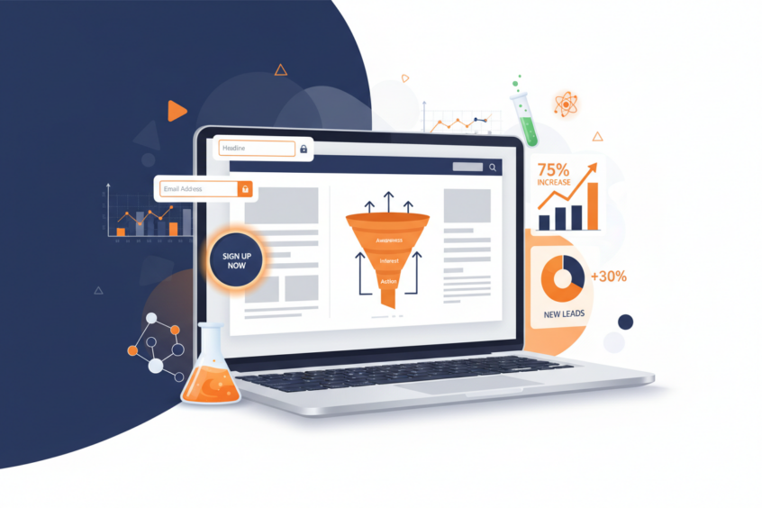
Landing Page Design: The Science Behind High Conversion Rates
Every second that passes, millions of potential customers land on websites across the internet. Yet most of them leave without taking any meaningful action. The difference between a visitor who bounces and one who converts often comes down to one critical element: your landing page design.
I’ve spent years analyzing what makes some landing pages convert at 2% while others soar to 15% or higher. The answer isn’t magic—it’s science. There’s a fascinating psychology behind how users interact with web pages, and understanding these principles can dramatically transform your conversion rates.

In this comprehensive guide, we’ll explore the research-backed strategies that separate high-converting landing pages from the rest. Whether you’re launching a new product, building an email list, or driving sales, these proven techniques will help you create landing pages that actually work.
The Psychology of First Impressions in Landing Page Design
Research from Stanford University reveals that users form opinions about your website in as little as 50 milliseconds. That’s faster than the blink of an eye. This split-second judgment determines whether visitors stay and explore or hit the back button immediately.
What exactly are users evaluating in those crucial first moments? Visual hierarchy plays a massive role. The human brain processes visual information 60,000 times faster than text, which means your design elements need to guide visitors toward your conversion goal before they even start reading.
Color psychology also influences these initial reactions. Blue tends to build trust and is widely used by financial institutions, while orange creates urgency and works well for call-to-action buttons. However, the key isn’t following rigid color rules—it’s about creating contrast that makes your most important elements stand out.
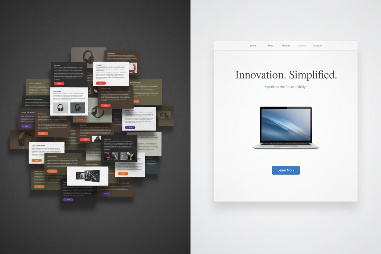
The concept of cognitive load is equally important. When visitors encounter too many choices or overwhelming information, their brains essentially shut down. This phenomenon, known as decision paralysis, can kill conversions faster than any technical issue.
Essential Elements That Drive Conversions
High-converting landing pages share certain fundamental elements, each serving a specific psychological purpose. Understanding why these components work helps you implement them more effectively.
Your headline serves as the hook that determines whether visitors continue reading. The most effective headlines clearly communicate value within 5-8 words while addressing a specific pain point. For instance, “Cut Your Energy Bills in Half” immediately tells visitors what they’ll gain and quantifies the benefit.
Social proof elements tap into our innate tendency to follow others’ behavior. Customer testimonials, user counts, and trust badges work because they reduce perceived risk. When someone sees “Join 50,000+ satisfied customers,” they’re more likely to trust your offering because others have already validated it.
The call-to-action button might seem simple, but it’s where conversions live or die. Research shows that action-oriented language like “Get My Free Guide” converts better than generic phrases like “Submit” or “Click Here.” The button should also create urgency without being pushy—a delicate balance that requires testing.
Visual elements like images and videos serve multiple purposes. They break up text to improve readability, demonstrate product benefits, and create emotional connections. However, every visual should support your conversion goal rather than simply decorating the page.
The Power of Persuasive Copywriting
Great landing page copy doesn’t just inform—it persuades. The difference lies in understanding your audience’s emotional triggers and addressing their specific concerns at the right moments.
Effective landing page copy follows a clear structure: problem identification, solution presentation, benefit explanation, and risk mitigation. This sequence mirrors how people naturally make decisions, making your message feel logical rather than salesy.
The language you choose matters enormously. Research from the Nielsen Norman Group shows that users scan web pages in an F-pattern, focusing on the first few words of headlines and bullet points. This means your most compelling benefits need to appear at the beginning of sentences.
Addressing objections proactively builds trust and reduces friction. If price is a common concern, include value justification. If credibility is questionable, add testimonials and guarantees. Think of your copy as having a conversation with a skeptical but interested friend.
Scarcity and urgency principles can boost conversions when used authentically. Limited-time offers or quantity restrictions work because they trigger our fear of missing out. However, fake scarcity backfires spectacularly, so only use these tactics when they’re genuine.
Visual Design Principles for Maximum Impact
Visual design isn’t about making things pretty—it’s about guiding behavior. Every design choice should either support or drive toward your conversion goal.
White space, often called negative space, gives your content room to breathe and helps visitors focus on what matters most. Apple’s landing pages masterfully use white space to draw attention to product features and purchase buttons. The principle is simple: less clutter equals clearer focus.
Typography hierarchy ensures visitors consume information in the right order. Your headline should be the largest text element, followed by subheadings, body text, and finally fine print. This creates a natural reading flow that leads visitors toward your call-to-action.
Directional cues subtly guide visitor attention. Images of people looking toward your call-to-action button, arrow graphics, or even the strategic placement of form fields can influence where visitors look next. These elements work subconsciously but powerfully.
Mobile responsiveness isn’t optional anymore—it’s essential. With over 50% of web traffic coming from mobile devices, your landing page must work flawlessly on smartphones and tablets. This means larger buttons, simplified navigation, and faster loading times.
The Role of Trust Signals and Social Proof
Trust is the foundation of all conversions. Without it, even the most compelling offer will fail. Smart landing page designers strategically place trust signals throughout the page to address different types of visitor concerns.
Security badges and certifications work particularly well for pages collecting personal information. Seeing SSL certificates, privacy policy links, or industry association logos helps visitors feel safe sharing their details.
Customer testimonials become more powerful when they include specific details and real photos. Generic praise like “Great service!” pales in comparison to “Sarah helped me increase my email open rates from 15% to 32% in just two weeks.” Specificity builds credibility.
Media mentions and press coverage serve as third-party validation. Being featured in recognizable publications suggests legitimacy and expertise. Even smaller publications can add credibility if they’re relevant to your target audience.
User-generated content like reviews, photos, or social media posts creates authentic social proof. This type of content feels more genuine than company-created testimonials because it comes directly from real customers.
Optimization Through A/B Testing
The most successful landing pages aren’t created—they’re evolved through systematic testing. A/B testing removes guesswork and lets actual user behavior guide your optimization decisions.
Start with high-impact elements that are likely to influence conversions. Headlines, call-to-action buttons, and value propositions typically produce the most significant results. Testing minor elements like font colors rarely moves the needle substantially.
Statistical significance is crucial for reliable results. Running tests for too short a period or with too few visitors can lead to false conclusions. Most experts recommend at least 1,000 conversions per variation before declaring a winner.
Document everything you test and learn. What works for one audience might not work for another, but patterns often emerge across different campaigns. Building a testing knowledge base helps you make better initial design decisions over time.
Consider testing entire page concepts rather than just individual elements. Sometimes a completely different approach outperforms incremental improvements to existing designs. Don’t be afraid to test radical departures from your current page.
Common Landing Page Mistakes That Kill Conversions
Even experienced marketers make critical errors that sabotage their conversion rates. Recognizing these mistakes helps you avoid them in your own campaigns.
Multiple competing calls-to-action confuse visitors and dilute your message. Every landing page should have one primary goal, and everything else should support that objective. If you want visitors to download an ebook, don’t also ask them to follow you on social media.
Slow loading speeds kill conversions before visitors even see your content. Research shows that 40% of users abandon pages that take longer than three seconds to load. Optimize images, minimize code, and choose reliable hosting to keep your pages fast.
Asking for too much information upfront creates unnecessary friction. Each additional form field reduces conversion rates, so only request information you absolutely need immediately. You can always gather more details later in your relationship with customers.
Ignoring mobile users is a costly mistake. Mobile visitors often have different needs and behaviors than desktop users. Your mobile landing page might need simplified copy, larger buttons, or even a completely different layout to maximize conversions.
Measuring and Analyzing Landing Page Performance
Creating a high-converting landing page is only half the battle—you need to measure its performance and continuously improve it. The right metrics tell you not just how well your page is performing, but why it’s performing that way.
Conversion rate is the obvious primary metric, but it doesn’t tell the whole story. Look at bounce rate to understand if visitors find your page relevant. High bounce rates often indicate a mismatch between your traffic source and page content.
Time on page and scroll depth reveal how engaged visitors are with your content. If people leave quickly or don’t scroll past your headline, you might need to strengthen your opening or improve your visual hierarchy.
Heat mapping tools show where visitors click, move their mouse, and focus their attention. This data reveals gaps between your intended user flow and actual behavior. You might discover that visitors are trying to click non-clickable elements or ignoring your call-to-action entirely.
Form analytics help identify where visitors drop off during the conversion process. If most people start filling out your form but abandon it at a specific field, that field might be asking for too much or unclear information.
Conclusion
High-converting landing pages aren’t the result of luck or guesswork—they’re the product of understanding human psychology and applying proven design principles. Every element from your headline to your call-to-action button should work together to guide visitors toward your conversion goal.
Remember that optimization is an ongoing process, not a one-time task. Consumer behavior evolves, new technologies emerge, and your business goals change. The landing pages that convert best today might need updates tomorrow.
Start by implementing the fundamental principles we’ve covered: clear value propositions, compelling headlines, strategic use of social proof, and friction-free conversion paths. Then test, measure, and refine based on real user data rather than assumptions.
The science behind high conversion rates is accessible to anyone willing to study their audience and systematically improve their approach. Your next landing page could be the one that transforms your business—if you apply these research-backed strategies consistently and measure the results carefully.
No More BS – Get a FREE Consultation
No more BS. Let’s talk real world $#!+ about what you need. You’ll meet with our top dog, and you’ll leave with a better understanding of what you need to do, and how RyCOM might help.