
Logo Design Inspiration: Trends for the Upcoming Year
The world of logo design never stands still. As we look ahead to the coming year, designers and brands alike are preparing to embrace fresh visual languages that speak to evolving consumer expectations and technological possibilities. Whether you’re a seasoned designer seeking inspiration or a business owner planning a rebrand, understanding these emerging trends can help you create logos that resonate with modern audiences while maintaining timeless appeal.
Logo design trends don’t just appear overnight—they emerge from cultural shifts, technological advances, and collective responses to what came before. This year promises to bring exciting developments that balance innovation with functionality, creating visual identities that work seamlessly across digital and physical touchpoints.
The Return of Hand-Drawn Elements
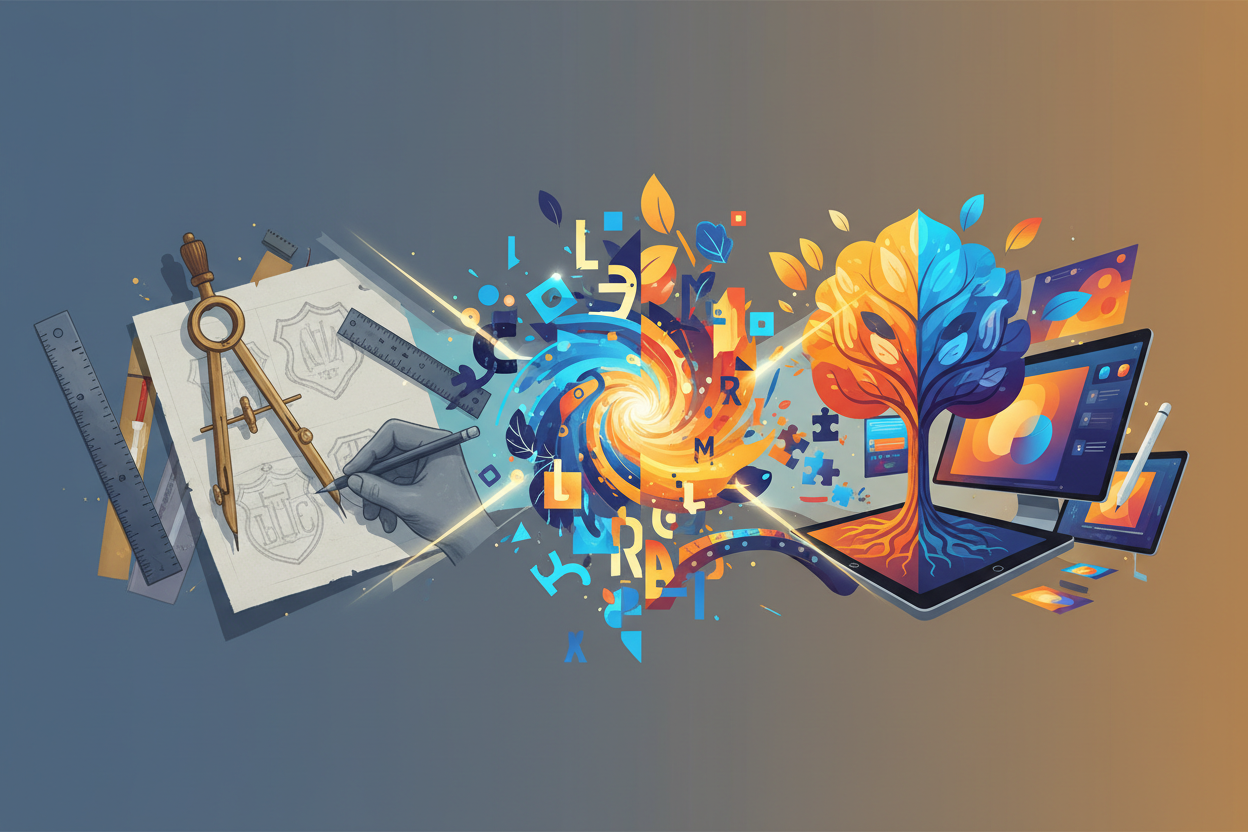
In an increasingly digital world, there’s something refreshingly authentic about hand-drawn logo elements. This trend represents a conscious move away from the sterile perfection of computer-generated graphics toward something more human and approachable. Hand-drawn logos feel personal, like someone took the time to craft something special just for you.
What makes this trend particularly compelling is its versatility. A hand-drawn element might be a custom lettering treatment, a sketchy illustration, or even subtle imperfections that give a logo character. These designs often incorporate visible brush strokes, uneven lines, or organic shapes that feel spontaneous yet intentional.
The psychological impact of hand-drawn elements shouldn’t be underestimated. In a marketplace saturated with polished corporate imagery, these logos stand out by feeling genuine and relatable. They suggest craftsmanship, attention to detail, and a brand that values the human touch over mass production.
Dynamic and Adaptive Logo Systems
Static logos are becoming increasingly limiting in our multi-platform world. The upcoming year will see more brands embracing dynamic logo systems that can adapt to different contexts while maintaining core brand recognition. These aren’t just responsive logos that scale well—they’re intelligent systems that can change colors, configurations, or even elements based on where they appear.
Think of a logo that might use different color palettes for different product lines, or one that incorporates seasonal elements while keeping its fundamental structure intact. These adaptive systems require careful planning and a deep understanding of brand architecture, but they offer unprecedented flexibility for modern marketing needs.
The technical possibilities for dynamic logos continue to expand as digital platforms become more sophisticated. We’re seeing logos that respond to user interactions, change based on time of day, or even incorporate real-time data feeds. While not every brand needs this level of complexity, the concept of adaptability is becoming essential for logos that need to work across diverse touchpoints.
Sustainable Design Philosophy
Environmental consciousness is reshaping logo design in subtle but meaningful ways. This isn’t just about using green colors or leaf motifs—it’s about creating designs that embody sustainable thinking from the ground up. Sustainable logo design considers the entire lifecycle of the brand identity, from production costs to digital efficiency.
Practically speaking, this might mean designing logos that reproduce well in single colors to reduce printing costs, or creating simplified versions that load quickly on websites to minimize energy consumption. Some designers are exploring logos that work effectively with eco-friendly printing methods or that can be easily adapted for sustainable packaging materials.
The aesthetic of sustainable design often embraces simplicity and longevity over trendy flourishes. These logos are built to last, reducing the need for frequent redesigns. They often feature clean lines, thoughtful use of negative space, and color palettes inspired by natural elements.
Bold Typography Takes Center Stage
Typography-focused logos are experiencing a renaissance, but with a twist. Instead of the minimalist sans-serif fonts that dominated recent years, we’re seeing a return to bold, expressive typography that makes a statement. These aren’t just wordmarks—they’re typographic experiences that convey personality and energy.
Custom lettering is particularly popular in this trend, allowing brands to create truly unique typographic identities. Designers are experimenting with unexpected weight combinations, creative ligatures, and letter modifications that turn simple text into memorable visual elements. The key is balancing creativity with legibility, ensuring that bold choices don’t compromise communication.
What’s driving this trend is partly a reaction to the homogenization of digital typography. As brands compete for attention in crowded digital spaces, distinctive typography becomes a powerful differentiator. A well-executed typographic logo can be more memorable and versatile than complex symbolic designs.
Nostalgic Color Palettes with Modern Twists
Color trends in logo design are taking an interesting turn toward nostalgia, but not in the way you might expect. Instead of simply recreating vintage color schemes, designers are taking inspiration from past eras and reinterpreting them through contemporary sensibilities. This creates a sense of familiarity while feeling fresh and current.
We’re seeing warm, earthy tones reminiscent of the 1970s being paired with modern gradients or unexpected accent colors. Retro-inspired palettes from the 1980s and 1990s are being refined and sophisticated for today’s market. The result is color combinations that feel both timeless and timely.
The psychology behind nostalgic colors is fascinating. These palettes can evoke feelings of comfort, authenticity, and trust—valuable qualities in uncertain times. However, the modern twist prevents these designs from feeling dated or out of touch. It’s a delicate balance that requires skill and intuition to execute effectively.
Geometric Precision Meets Organic Flow
One of the most intriguing trends emerging is the fusion of geometric precision with organic, flowing elements. This isn’t about choosing between structured or natural design—it’s about finding harmony between both approaches. The result is logos that feel both professional and approachable, technical and human.
This trend might manifest as geometric shapes with softened corners, precise grids that incorporate hand-drawn elements, or mathematical patterns that suggest natural forms. The contrast between rigid and fluid creates visual tension that draws the eye and creates memorable impressions.
From a practical standpoint, this hybrid approach offers the best of both worlds. Geometric elements provide structure and scalability, while organic touches add personality and warmth. This combination works particularly well for technology companies that want to appear innovative yet accessible, or for service-based businesses that need to balance professionalism with approachability.
Minimalism Evolves: Purposeful Simplicity
Minimalism in logo design isn’t going anywhere, but it’s evolving beyond simple reduction. The new minimalism is about purposeful simplicity—every element serves a specific function, and nothing is removed without careful consideration. This approach creates logos that are clean and uncluttered while still being rich with meaning.
The difference between this evolved minimalism and its predecessors lies in intentionality. Rather than stripping away elements until only the basics remain, designers are starting with clear communication goals and building up only what’s necessary to achieve them. This process often results in logos that appear simple but reveal layers of meaning upon closer inspection.
This trend also reflects a maturing understanding of how logos function in digital environments. Purposeful simplicity ensures that logos remain effective at any size, from favicon to billboard, while maintaining their essential character and recognition value.
Cultural Authenticity and Inclusive Design
Perhaps the most important trend shaping logo design is the growing emphasis on cultural authenticity and inclusive design. This goes beyond surface-level representation to consider how logos can genuinely reflect and respect diverse communities and perspectives. It’s about creating visual identities that feel welcoming to all audiences while avoiding appropriation or stereotyping.
Authentic cultural representation in logo design requires research, sensitivity, and often collaboration with community members. It might involve incorporating traditional artistic techniques, using culturally significant colors or symbols appropriately, or simply ensuring that design choices don’t inadvertently exclude or alienate certain groups.
Inclusive design also considers accessibility from the outset. This means ensuring adequate color contrast for visually impaired users, creating designs that work well in various cultural contexts, and considering how logos will be perceived across different demographic groups. The result is stronger, more universally appealing brand identities.
Looking Forward: Implementing These Trends
As exciting as these trends are, it’s important to remember that effective logo design isn’t about following every trend—it’s about selecting approaches that align with your brand’s unique needs and values. The best logos often incorporate elements from multiple trends while maintaining a cohesive vision that serves the brand’s long-term goals.
When considering these trends for your own projects, think about your audience, your industry, and your brand personality. A hand-drawn approach might be perfect for a artisanal food brand but inappropriate for a financial services company. Similarly, bold typography might work wonderfully for a entertainment brand but could feel too aggressive for a healthcare organization.
The key is to use these trends as inspiration rather than prescription. Take elements that resonate with your brand story and adapt them to create something uniquely yours. The most successful logos of the upcoming year will be those that feel both contemporary and timeless, trendy and authentic.
As we move into this new design landscape, remember that great logo design has always been about clear communication, memorable aesthetics, and authentic brand expression. These trends simply provide new tools and approaches for achieving those timeless goals. Whether you embrace bold typography, experiment with dynamic systems, or find your own unique fusion of geometric and organic elements, the most important thing is creating a logo that truly represents what your brand stands for.
The upcoming year promises to be an exciting time for logo design, full of creative possibilities and fresh approaches to visual identity. By staying informed about these trends while remaining true to your brand’s unique character, you’ll be well-positioned to create logos that not only look great today but will continue to serve your brand effectively for years to come.
No More BS – Get a FREE Consultation
No more BS. Let’s talk real world $#!+ about what you need. You’ll meet with our top dog, and you’ll leave with a better understanding of what you need to do, and how RyCOM might help.