
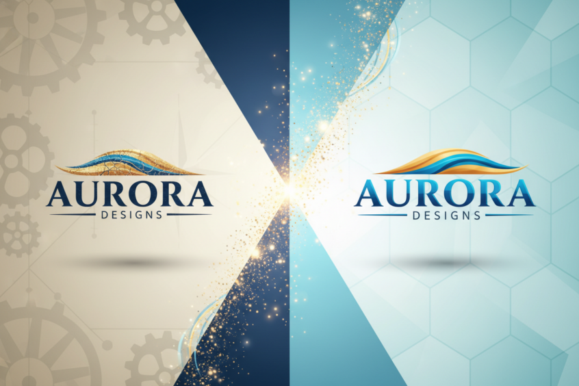
Logo Redesign: Refreshing Your Look Without Losing Legacy
Your logo has been with you through thick and thin. It’s graced countless business cards, adorned your storefront, and become synonymous with your brand’s identity. But now you’re staring at it, wondering if it’s time for a change. Maybe it feels a bit dated, or perhaps your business has evolved beyond what your current logo represents. The question isn’t whether you should consider a logo redesign—it’s how to refresh your visual identity while preserving the brand equity you’ve worked so hard to build.
Logo redesign is one of the most delicate balancing acts in branding. Push too far in one direction, and you risk alienating loyal customers who’ve grown attached to your familiar mark. Don’t push far enough, and you might miss the opportunity to revitalize your brand and attract new audiences. The sweet spot lies in evolution, not revolution.
Understanding the Need for Logo Evolution
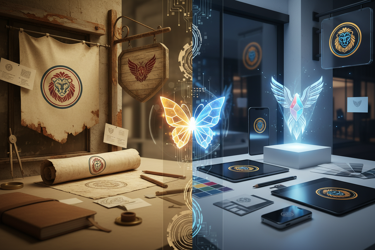
Before diving into the redesign process, it’s crucial to understand why logos need to evolve in the first place. Think about some of the world’s most recognizable brands—Apple, McDonald’s, or Coca-Cola. Each has undergone multiple logo iterations throughout their history, yet they’ve maintained their core identity and brand recognition.
The digital landscape has fundamentally changed how we interact with logos. What looked crisp and professional in print twenty years ago might appear cluttered or illegible on a smartphone screen. Modern logos need to be versatile enough to work across countless touchpoints, from social media avatars to billboard advertisements, from app icons to embroidered merchandise.

Consumer expectations have evolved too. Today’s audiences appreciate clean, minimalist design that communicates authenticity and transparency. Overly complex logos with gradients, shadows, and intricate details often feel outdated in our current visual culture. This shift doesn’t mean your logo needs a complete overhaul—sometimes, simplifying existing elements can breathe new life into your brand mark.
Assessing Your Current Brand Equity
Before making any changes, take a step back and honestly evaluate what your current logo has going for it. Brand equity isn’t just about how pretty your logo looks—it’s about the recognition, trust, and emotional connection your audience has built with your visual identity over time.
Start by gathering feedback from different stakeholder groups. Your longtime customers might have a completely different perspective than new prospects or younger demographics. What elements of your current logo do people remember most? Which aspects do they associate most strongly with your brand values? This research phase is invaluable because it helps identify the non-negotiable elements that must be preserved in any redesign.
Consider conducting informal surveys or focus groups. Ask customers to describe your brand personality and see how closely their responses align with your logo’s current visual language. Sometimes, you’ll discover that certain elements of your logo are working harder than you realized, while others might be creating unintended associations or barriers to connection.
Strategic Approaches to Logo Refresh
Once you’ve identified what’s worth preserving, you can explore different approaches to refreshing your logo. The most successful logo redesigns typically fall into one of several strategic categories, each with its own benefits and considerations.
The refinement approach involves making subtle adjustments to improve your logo’s functionality and visual appeal without dramatically altering its core elements. This might mean cleaning up typography, adjusting proportions, or simplifying complex details. Companies like Google have mastered this approach, making their logo more versatile and modern while maintaining instant recognition.
Color evolution represents another powerful strategy. Sometimes, your logo’s structure is perfect, but the color palette needs updating to feel more contemporary or to work better across digital platforms. Consider how you might adjust saturation, introduce new accent colors, or even explore how your logo performs in monochrome applications.
Typography updates can dramatically modernize a logo without touching other elements. If your logo includes text, consider whether the current font choice still reflects your brand personality and performs well at various sizes. Custom lettering or a carefully selected typeface can make your logo feel fresh and current while preserving familiar shapes and proportions.
Preserving Brand Recognition During Redesign
The most critical aspect of any logo refresh is maintaining the visual cues that trigger brand recognition. These cues might be more subtle than you think—perhaps it’s the specific angle of a swoosh, the proportional relationship between elements, or even the way negative space is used within your design.
One effective strategy is to create a visual audit of your logo’s key recognition triggers. Break down your current logo into its component parts: shapes, colors, typography, and spatial relationships. Which of these elements are most distinctive? Which combinations create the strongest association with your brand? This analysis will help you identify the essential DNA that must carry forward into your refreshed design.
Consider implementing changes gradually if possible. Some brands successfully transition by introducing their refreshed logo in specific contexts first—perhaps in digital applications or new marketing materials—while maintaining their original logo in established locations. This approach allows audiences to become familiar with the updated design while still providing the comfort of familiar branding in key touchpoints.
Testing and Validating Your New Direction
Never underestimate the importance of testing your redesigned logo before making it official. What looks perfect in your design software might perform differently in real-world applications. Test your new logo across various sizes, from large-format prints to tiny social media avatars. Ensure it remains legible and impactful whether it’s embroidered on a polo shirt or displayed on a highway billboard.
Gather feedback from fresh eyes—people who haven’t been involved in the design process can offer valuable perspectives on clarity, memorability, and brand alignment. Sometimes, designers and stakeholders become too close to a project to see potential issues that might be obvious to outside observers.
Consider A/B testing your refreshed logo in controlled environments if possible. This might involve using different versions in separate marketing campaigns or testing recognition and recall with focus groups. The data you gather during this phase can validate your design decisions and provide confidence as you move toward full implementation.
Implementation Strategy for Maximum Impact
Rolling out a refreshed logo requires careful planning and coordination across all brand touchpoints. Create a comprehensive audit of everywhere your current logo appears—from business cards and letterhead to vehicle wraps and digital properties. Prioritize updates based on visibility and frequency of customer interaction.
Develop clear brand guidelines that explain how to use your refreshed logo correctly. Include specifications for minimum sizes, clear space requirements, appropriate color applications, and examples of what not to do. These guidelines will be essential for maintaining consistency as your refreshed logo appears across different applications and potentially different vendors or team members.
Consider your communication strategy carefully. How will you introduce the refreshed logo to your existing audience? Some brands benefit from explaining the reasoning behind their evolution, while others prefer to let the updated design speak for itself. The approach you choose should align with your brand personality and the relationship you have with your customers.
Learning from Successful Logo Evolution
Some of the most instructive examples of successful logo evolution come from brands that have managed to stay relevant across decades while maintaining their core identity. Pepsi has undergone numerous logo updates throughout its history, each time modernizing its appearance while preserving the distinctive circular badge format and red, white, and blue color scheme that customers associate with the brand.
Similarly, Mastercard’s recent logo evolution demonstrates how brands can simplify and modernize while strengthening recognition. By removing the company name from their primary logo mark, they’ve created a more versatile symbol that works across global markets and digital applications, while the interlocking circles remain instantly recognizable to consumers worldwide.
These successful evolutions share common characteristics: they respect brand heritage while embracing contemporary design principles, they improve functionality across multiple applications, and they maintain the visual elements that trigger immediate brand recognition.
Conclusion
Logo redesign doesn’t have to be a choice between honoring your past and embracing your future. The most successful brand refreshes find ways to do both, creating visual identities that feel both familiar and fresh. By carefully analyzing your current brand equity, identifying the elements that drive recognition, and implementing changes thoughtfully, you can evolve your logo in ways that strengthen rather than compromise your brand’s position in the marketplace.
Remember that logo evolution is an ongoing process, not a one-time event. The brands that remain visually relevant are those that continuously assess and refine their visual identity in response to changing markets, technologies, and consumer expectations. Your refreshed logo should be designed not just for today, but with enough flexibility and timeless appeal to serve your brand well into the future.
The key is to approach logo redesign as brand evolution rather than brand revolution. When done thoughtfully, a logo refresh can reinvigorate your brand, attract new audiences, and create renewed enthusiasm among existing customers—all while preserving the valuable brand equity you’ve built over time.
No More BS – Get a FREE Consultation
No more BS. Let’s talk real world $#!+ about what you need. You’ll meet with our top dog, and you’ll leave with a better understanding of what you need to do, and how RyCOM might help.