
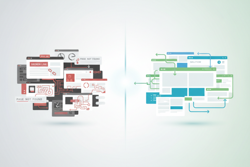
Top 10 Website Design Mistakes to Avoid in 2024
Creating a successful website isn’t just about having great content or an amazing product. The design of your website plays a crucial role in determining whether visitors stay and convert or click away within seconds. After years of analyzing countless websites and witnessing both spectacular successes and devastating failures, I’ve compiled the most common website design mistakes that continue to plague businesses today.
Your website is often the first impression potential customers have of your brand. A poorly designed site can undermine even the best business strategies, while a well-crafted one can turn casual browsers into loyal customers. Let’s dive into the ten most critical website design mistakes you need to avoid to ensure your online presence works for you, not against you.
1. Ignoring Mobile Responsiveness
In today’s mobile-first world, failing to optimize your website for smartphones and tablets is perhaps the most costly mistake you can make. With over 60% of web traffic coming from mobile devices, a non-responsive website essentially alienates more than half of your potential audience.
Mobile responsiveness isn’t just about making your site smaller to fit on a phone screen. It involves creating a seamless user experience across all devices, ensuring that navigation remains intuitive, text stays readable without zooming, and buttons are easily tappable. Google also prioritizes mobile-friendly websites in search rankings, making this mistake doubly damaging to your online visibility.
The solution is implementing responsive web design from the ground up. Test your website on various devices and screen sizes regularly, and consider adopting a mobile-first design approach where you design for mobile devices first, then scale up for larger screens.
2. Overwhelming Users with Cluttered Layouts
We’ve all visited websites that feel like digital junkyards – packed with information, widgets, pop-ups, and elements competing for attention. This visual chaos doesn’t just look unprofessional; it actively drives visitors away and makes it nearly impossible for them to find what they’re looking for.
Cluttered layouts stem from a common misconception that more information equals more value. In reality, effective web design follows the principle of less is more. White space isn’t wasted space – it’s a powerful design tool that helps guide users’ attention and creates a sense of sophistication and clarity.
Focus on creating clean, organized layouts with plenty of breathing room between elements. Prioritize your most important content and features, and don’t be afraid to remove elements that don’t serve a clear purpose. Remember, every element on your page should either help users accomplish their goals or support your business objectives.
3. Using Poor Navigation Structure
Navigation is the roadmap of your website, and when it’s confusing or poorly structured, users quickly become lost and frustrated. Complex menu structures, unclear labeling, and hidden navigation elements create barriers between your visitors and the information they seek.
Effective navigation should be intuitive and follow established web conventions. Users shouldn’t have to think about how to find information on your site. The classic rule of thumb suggests that any page on your website should be reachable within three clicks from the homepage.
Implement clear, descriptive menu labels and maintain consistency throughout your site. Consider adding a search function for content-heavy websites, and always include a clear path back to the homepage. Breadcrumb navigation can also help users understand their location within your site structure.
4. Neglecting Page Loading Speed
In our instant-gratification digital world, every second counts. Studies consistently show that users abandon websites that take longer than three seconds to load, and even a one-second delay can significantly impact conversion rates.
Slow loading speeds often result from oversized images, excessive plugins, bloated code, or inadequate hosting solutions. These technical issues might seem invisible to you as the website owner, but they create very real barriers for your visitors.
Optimize your images by compressing them without sacrificing quality, minimize HTTP requests, and choose reliable hosting services. Tools like Google PageSpeed Insights can help identify specific areas for improvement. Remember, faster websites not only provide better user experiences but also rank higher in search engine results.
5. Implementing Poor Typography Choices
Typography is more than just choosing pretty fonts – it’s about creating readable, accessible content that effectively communicates your message. Poor font choices, inadequate contrast, or inappropriate sizing can make your content virtually unreadable for many users.
Common typography mistakes include using too many different fonts, choosing decorative fonts for body text, creating insufficient contrast between text and background colors, and sizing text too small for comfortable reading. These issues particularly impact users with visual impairments or those viewing your site on smaller screens.
Stick to web-safe fonts and limit yourself to two or three font families maximum. Ensure sufficient contrast ratios for accessibility compliance, and make your text large enough to read comfortably without zooming. Consider your brand personality when choosing fonts, but never sacrifice readability for style.
6. Lacking Clear Call-to-Action Buttons
Your website exists for a purpose – whether that’s generating leads, making sales, or encouraging newsletter signups. Without clear, compelling call-to-action buttons, you’re leaving conversions to chance and missing opportunities to guide users toward your desired outcomes.
Weak call-to-action buttons often suffer from poor visibility, vague language, or unclear placement. Buttons that blend into the background, use generic text like “Click Here,” or appear in unexpected locations fail to motivate user action.
Create prominent, visually distinct buttons with action-oriented language that clearly communicates the benefit users will receive. Use contrasting colors to make buttons stand out, and place them strategically throughout your site where users are most likely to be ready to take action. Test different button colors, sizes, and text to optimize conversion rates.
7. Missing or Inadequate Contact Information
Trust is fundamental to online business success, and nothing erodes trust faster than making it difficult for customers to contact you. Websites that hide contact information or provide only generic email addresses appear unprofessional and potentially untrustworthy.
This mistake is particularly damaging for local businesses or service providers where customers want assurance they’re dealing with legitimate, accessible companies. Even e-commerce sites benefit from clear contact information that helps customers feel confident about their purchases.
Make your contact information easily accessible from every page of your website, preferably in the header or footer. Include multiple contact methods such as phone numbers, email addresses, and physical addresses when relevant. Consider adding a contact form for user convenience, and ensure you respond promptly to inquiries.
8. Overusing Stock Photos and Generic Images
Visual content plays a crucial role in website engagement, but generic stock photos can make your site feel impersonal and inauthentic. Those obviously staged photos of people pointing at computers or shaking hands in conference rooms don’t fool anyone and can actually harm your credibility.
Overused stock images create a disconnect between your brand and your audience. They suggest a lack of investment in your online presence and can make your business appear generic or untrustworthy. Users have become adept at recognizing and dismissing obviously fake imagery.
Invest in original photography that reflects your actual business, products, or team members. If budget constraints require stock photos, choose authentic-looking images and avoid the most obviously staged shots. Consider using illustrations or graphics that align with your brand identity as alternatives to generic photography.
9. Ignoring Search Engine Optimization Best Practices
Building a beautiful website means nothing if people can’t find it. Ignoring basic SEO principles during the design phase can severely limit your website’s visibility and organic traffic potential.
Common SEO mistakes in web design include missing or poorly written meta descriptions, lack of proper heading structure, missing alt text for images, and failing to create SEO-friendly URLs. These oversights make it harder for search engines to understand and rank your content.
Implement proper heading hierarchies using H1, H2, and H3 tags, write compelling meta descriptions for each page, and include descriptive alt text for all images. Create clean, descriptive URLs and ensure your site structure supports easy crawling by search engines. Remember that SEO isn’t an afterthought – it should be integrated into your design process from the beginning.
10. Forgetting About Accessibility Standards
Web accessibility ensures that people with disabilities can effectively use your website. Beyond being the right thing to do, accessibility compliance is increasingly becoming a legal requirement and can significantly expand your potential audience.
Accessibility mistakes include insufficient color contrast, lack of keyboard navigation support, missing alt text for images, and poor heading structure. These issues don’t just affect users with disabilities – they can impact anyone using assistive technologies or browsing in challenging conditions.
Follow Web Content Accessibility Guidelines (WCAG) when designing your site. Ensure sufficient color contrast ratios, provide alternative text for images, make your site navigable via keyboard, and use semantic HTML markup. Many accessibility improvements also benefit SEO and overall user experience.
Moving Forward with Better Website Design
Avoiding these common website design mistakes isn’t just about following best practices – it’s about creating meaningful connections with your audience and building a strong foundation for online success. Each mistake on this list has the potential to cost you visitors, customers, and revenue.
The good news is that most of these issues are entirely preventable with proper planning and attention to detail. Start by auditing your current website against this list, prioritizing the most critical issues for your specific situation. Remember that website design is an ongoing process, not a one-time project.
Great website design balances aesthetics with functionality, creativity with usability, and business goals with user needs. By avoiding these common pitfalls and focusing on creating genuine value for your visitors, you’ll be well on your way to building a website that not only looks professional but actually drives results for your business. Take the time to get these fundamentals right, and your website will become a powerful asset rather than a missed opportunity.
No More BS – Get a FREE Consultation
No more BS. Let’s talk real world $#!+ about what you need. You’ll meet with our top dog, and you’ll leave with a better understanding of what you need to do, and how RyCOM might help.