

Brochure Design: Making Your Message Stand Out in a Digital World
In today’s fast-paced digital landscape, you might wonder if brochures still have a place in effective marketing. The answer is a resounding yes! While we’re constantly bombarded with digital content, there’s something uniquely powerful about holding a well-designed brochure in your hands. It creates a tangible connection between your brand and your audience that pixels on a screen simply can’t replicate.
Whether you’re a small business owner trying to attract local customers, a nonprofit organization seeking donations, or a corporate entity launching a new product, mastering the art of brochure design can be your secret weapon for cutting through the noise. The key lies not just in creating something that looks pretty, but in crafting a piece that communicates your message with clarity, impact, and memorability.

Understanding the Psychology Behind Effective Brochure Design
Before diving into the technical aspects of brochure design, it’s crucial to understand how people interact with printed materials. Unlike digital content that competes for attention with notifications and distractions, a brochure commands focused attention. When someone picks up your brochure, they’re making a conscious decision to engage with your message.
Research shows that people process visual information 60,000 times faster than text, which means your design choices have mere seconds to make an impression. The colors you choose, the fonts you select, and the images you incorporate all work together to create an emotional response before your audience even reads a single word.
This psychological advantage of print materials creates what marketers call “high-involvement processing.” When people hold something physical, they’re more likely to remember the information and develop a stronger emotional connection to your brand. This is why a thoughtfully designed brochure can often outperform digital alternatives in terms of recall and engagement.
Essential Elements of Outstanding Brochure Design
Creating a brochure that stands out requires careful attention to several fundamental design elements. Each component plays a crucial role in ensuring your message not only reaches your audience but resonates with them long after they’ve put your brochure down.
The hierarchy of information is perhaps the most critical element to master. Your headline should immediately communicate your value proposition, followed by supporting subheadings that guide readers through your key messages. Think of your brochure as a roadmap – every element should lead your reader naturally from one point to the next, building interest and understanding along the way.
White space, often overlooked by amateur designers, is actually one of your most powerful tools. It gives your content room to breathe and helps prevent the overwhelming feeling that comes with cluttered layouts. Strategic use of white space can draw attention to your most important messages and make your brochure feel more premium and professional.
Color Psychology and Brand Consistency in Brochure Design
Colors aren’t just aesthetic choices – they’re powerful communication tools that can influence emotions, perceptions, and even purchasing decisions. Understanding color psychology can dramatically improve your brochure’s effectiveness in conveying your intended message.
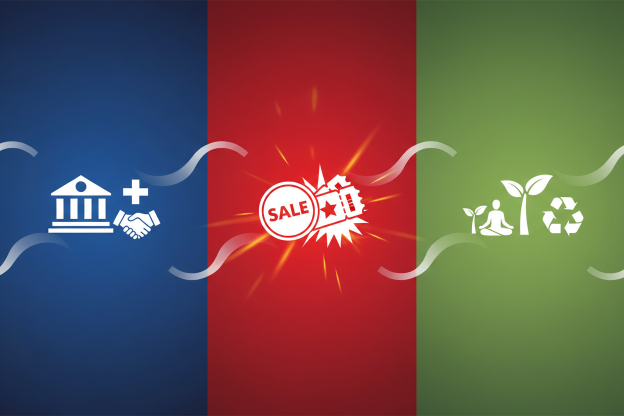
Blue, for instance, conveys trust and reliability, making it an excellent choice for financial services or healthcare organizations. Red creates urgency and excitement, perfect for promotional offers or entertainment venues. Green suggests growth and harmony, ideal for environmental organizations or wellness brands. The key is selecting colors that align with both your brand identity and the emotional response you want to evoke.
Brand consistency across all your marketing materials, including brochures, builds recognition and trust. Your brochure should feel like a natural extension of your brand, using the same color palette, fonts, and visual style as your website, business cards, and other marketing materials. This consistency helps reinforce your brand identity and makes your business appear more professional and established.
Typography That Speaks Volumes
The fonts you choose for your brochure design can make or break the entire piece. Typography isn’t just about making text readable – it’s about creating personality, establishing hierarchy, and guiding your reader’s eye through your content in a logical, engaging way.
A good rule of thumb is to limit yourself to two or three font families maximum. Use one font for headlines, another for body text, and perhaps a third for accent elements like quotes or callouts. This restraint creates visual harmony while still allowing for variety and interest.
Readability should always be your top priority. While decorative fonts might look appealing for headlines, they can quickly become tiresome for longer blocks of text. Choose fonts that are easy to read at various sizes, and always consider your target audience. A brochure for a law firm might call for more traditional, serif fonts, while a tech startup might benefit from clean, modern sans-serif options.
Strategic Layout and Fold Considerations
The physical format of your brochure significantly impacts how your message is received and understood. The most common formats – tri-fold, bi-fold, and z-fold – each offer unique advantages for organizing and presenting information.
A tri-fold brochure creates six panels of content, allowing you to tell a story that unfolds as the reader opens each section. The front panel serves as your hook, the inside panels develop your message, and the back panel typically contains contact information and calls to action. This format works particularly well for service-based businesses that need to explain complex offerings.
Bi-fold brochures, with their four panels, offer more space for detailed information and larger images. They’re excellent for product catalogs, event programs, or situations where you need to showcase multiple items or services with accompanying visuals.
Understanding how people naturally interact with folded materials helps you place your most important information in the spots where eyes naturally land first. The front panel and the first inside panel typically receive the most attention, so use these prime real estate areas for your strongest messages.
Compelling Content Strategy for Maximum Impact
Even the most beautiful design falls flat without compelling content. Your brochure’s text should be concise, benefit-focused, and written in language that resonates with your specific audience. Avoid industry jargon unless your audience expects it, and always focus on what your product or service can do for the reader, not just what it is.
The headline is your first and most important opportunity to grab attention. It should clearly communicate your main benefit or value proposition in a way that makes people want to learn more. Questions, bold statements, and specific benefits tend to work better than generic company slogans or vague promises.
Throughout your brochure, use active voice and action-oriented language. Instead of saying “Our services can be customized,” try “We customize our services to fit your unique needs.” This subtle shift makes your content more engaging and creates a stronger sense of partnership with your readers.
Visual Elements That Enhance Your Message
Images, illustrations, and graphics serve as powerful supplements to your text, helping to break up content, illustrate key points, and create emotional connections. However, visuals should never be used simply to fill space – every image should have a purpose and contribute to your overall message.
High-quality photography can instantly elevate the perceived value of your brochure and your brand. Whether you’re showcasing products, highlighting your team, or illustrating your services in action, professional photos create credibility and help readers visualize themselves benefiting from what you offer.
Infographics and charts can be particularly effective for presenting complex information in an easily digestible format. Statistics, process flows, and comparison charts help readers understand your message quickly while adding visual interest to your layout.
Print Quality and Material Considerations
The physical quality of your brochure speaks volumes about your brand before anyone reads a single word. The paper weight, finish, and printing quality all contribute to the overall impression your brochure makes on potential customers.
Heavier paper stocks convey quality and permanence, while lighter weights might be more cost-effective for mass distribution. Glossy finishes make colors pop and photographs shine, while matte finishes offer a more sophisticated, understated feel that’s easier to write on if needed.
Consider special finishing options like UV coating, embossing, or foil stamping for high-impact pieces where budget allows. These premium touches can help your brochure stand out from the competition and create a memorable tactile experience that reinforces your brand’s quality positioning.
Measuring Success and Iterating Your Design
Creating an effective brochure is often an iterative process that improves over time based on real-world feedback and results. Tracking the success of your brochures helps you understand what resonates with your audience and what might need adjustment for future versions.
Include trackable elements like QR codes, specific phone numbers, or unique web addresses that allow you to measure how many people are responding to your brochure. This data helps you calculate return on investment and identify which distribution methods and design elements are most effective.
Don’t be afraid to test different versions of your brochure with small groups before committing to a large print run. A/B testing different headlines, layouts, or calls to action can provide valuable insights that significantly improve your results.
Conclusion: Creating Brochures That Make Lasting Impressions
In a world saturated with digital marketing messages, a well-designed brochure offers a refreshing opportunity to create meaningful, tangible connections with your audience. By thoughtfully combining compelling content, strategic design elements, and high-quality production, your brochure can become a powerful tool that not only stands out but drives real business results.
Remember that effective brochure design is about more than just making something that looks good – it’s about creating a piece that serves your business objectives while providing genuine value to your readers. Whether you’re building brand awareness, generating leads, or supporting sales conversations, a strategically designed brochure can be the bridge that transforms casual interest into committed action.
The investment in professional brochure design pays dividends through increased credibility, improved response rates, and stronger brand recognition. In our increasingly digital world, the businesses that master the art of effective print communication will find themselves with a distinct competitive advantage that’s both memorable and measurable.
No More BS – Get a FREE Consultation
No more BS. Let’s talk real world $#!+ about what you need. You’ll meet with our top dog, and you’ll leave with a better understanding of what you need to do, and how RyCOM might help.