
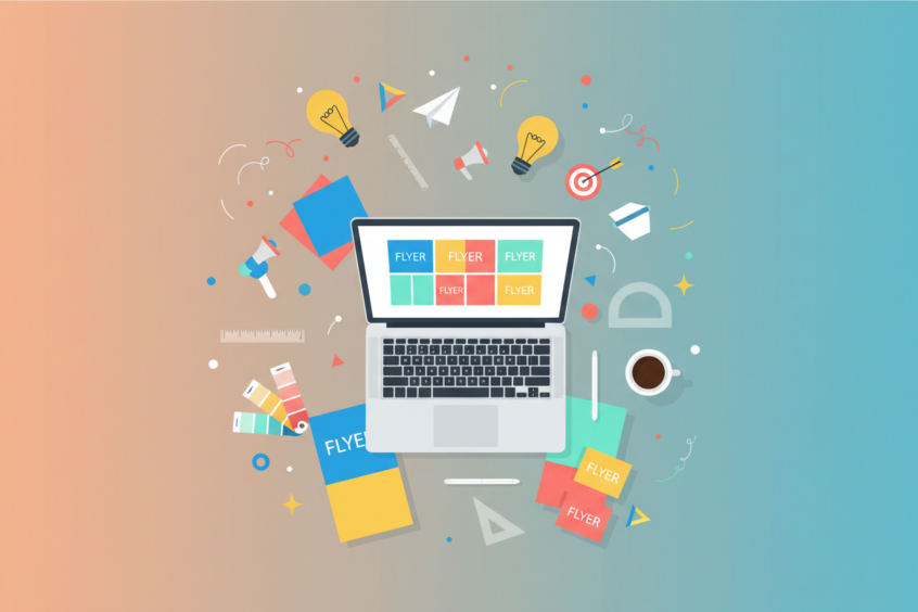
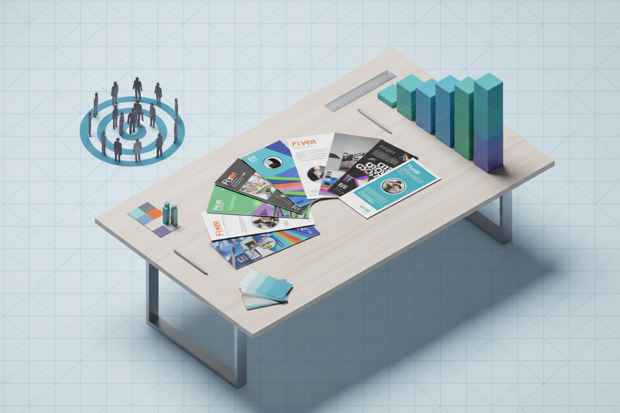
Flyer Design: Creative Ideas for Effective Promotion
In today’s fast-paced digital world, you might think traditional marketing materials like flyers have lost their charm. However, well-designed flyers remain one of the most cost-effective and impactful ways to promote your business, event, or cause. The key lies in creating designs that not only catch the eye but also compel people to take action.
Whether you’re advertising a local coffee shop’s grand opening, promoting a community fundraiser, or launching a new product line, flyer design can make or break your promotional campaign. The difference between a flyer that gets tossed in the trash and one that drives real results often comes down to thoughtful design choices and strategic creativity.
Understanding Your Target Audience
Before diving into color palettes and font choices, successful flyer design starts with understanding who you’re trying to reach. Your audience’s demographics, interests, and preferences should guide every design decision you make.
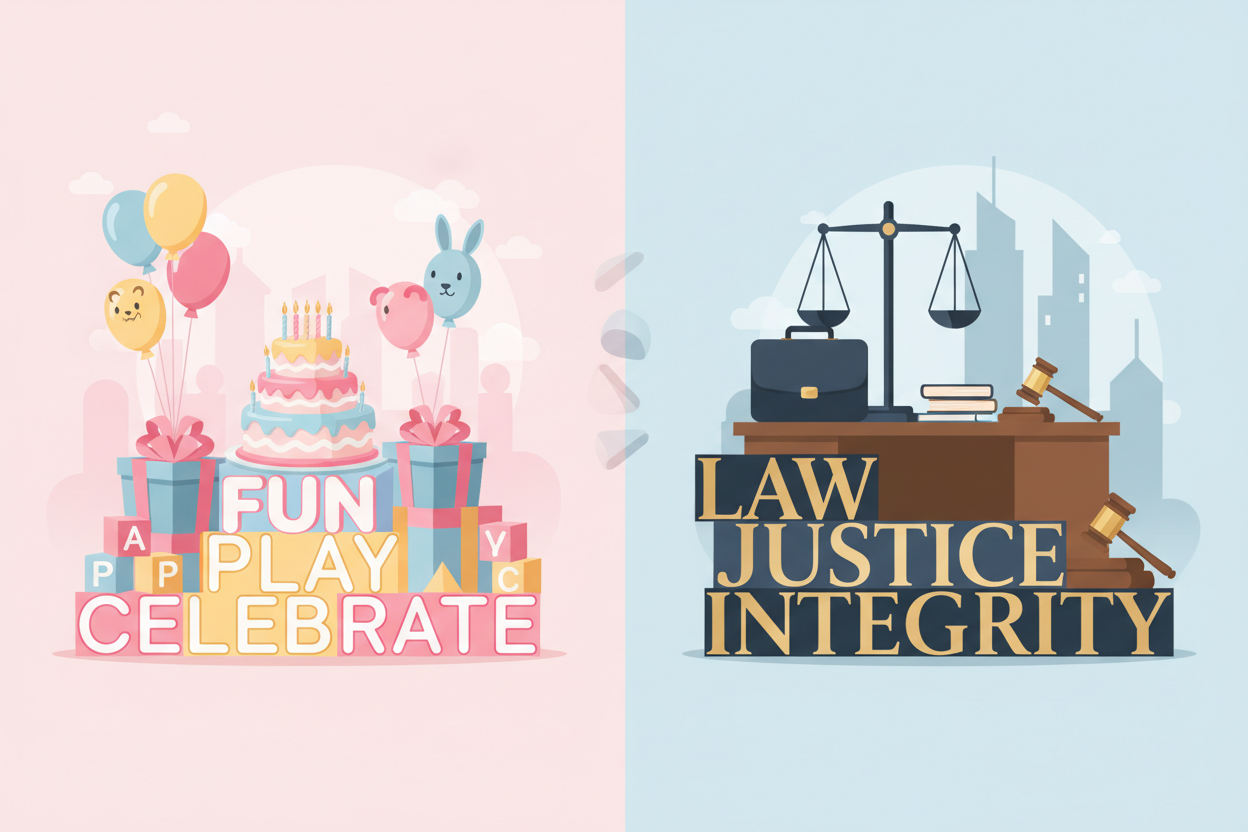
Consider a flyer for a trendy fitness studio versus one for a retirement community event. The fitness studio flyer might feature bold, energetic colors, dynamic typography, and images of people in action. Meanwhile, the retirement community flyer would likely benefit from larger, easy-to-read fonts, calming colors, and clear, straightforward messaging.
Take time to research your target demographic’s visual preferences. What social media platforms do they use? What magazines do they read? What websites do they visit? These insights will help you create designs that resonate with your specific audience rather than trying to appeal to everyone.
Essential Design Elements That Drive Results
Effective flyer design relies on several fundamental elements working together harmoniously. Each component plays a crucial role in capturing attention and communicating your message clearly.
Typography serves as the backbone of your flyer’s communication. Choose fonts that reflect your brand’s personality while maintaining excellent readability. A playful script font might work perfectly for a children’s birthday party service, but it would be inappropriate for a law firm’s promotional material. Stick to no more than two or three font families to maintain visual consistency and avoid overwhelming your readers.
Color psychology significantly impacts how people perceive and respond to your flyer. Red creates urgency and excitement, making it ideal for sales promotions or events with limited time offers. Blue conveys trust and professionalism, perfect for financial services or healthcare providers. Green suggests growth, health, and environmental consciousness, while purple often represents luxury and creativity.
White space, often called negative space, gives your design room to breathe and helps guide the reader’s eye through your content. Many novice designers feel compelled to fill every inch of their flyer, but strategic use of white space actually makes your message more impactful and easier to digest.
Creative Layout Strategies
The layout of your flyer determines how effectively you can guide your reader’s attention and communicate your key messages. Think of your flyer as a visual journey that leads the reader from initial interest to desired action.
The Z-pattern layout works exceptionally well for flyers because it follows natural reading patterns. Place your most important information along the Z-path: start with an attention-grabbing headline at the top left, include supporting details in the middle, and end with your call-to-action at the bottom right.
For more image-heavy designs, consider using the golden ratio or rule of thirds to create visually pleasing compositions. These mathematical principles help create balance and draw the eye naturally to focal points within your design.
Asymmetrical layouts can create dynamic, modern looks that stand out from traditional designs. However, they require careful attention to visual weight and balance to avoid appearing chaotic or unprofessional.
Visual Hierarchy and Information Flow
Creating clear visual hierarchy ensures that readers process your information in the order you intend. This concept becomes particularly important when you have multiple pieces of information competing for attention.
Start with your most compelling headline or offer. This should be the largest, boldest element on your flyer. Secondary information like event details, product features, or company credentials should be smaller but still easily readable. Finally, include essential details like contact information, dates, and legal disclaimers in the smallest, yet legible, text size.
Use contrast effectively to establish hierarchy. This doesn’t just mean light versus dark colors – you can create contrast through size, weight, texture, and positioning. A bold, sans-serif headline paired with lighter, serif body text creates both visual interest and clear information hierarchy.
Incorporating Compelling Imagery
Images can communicate emotions and concepts faster than text alone, making them powerful tools for flyer design. However, choosing the right images requires strategic thinking beyond simply picking something that looks nice.
Authentic photography often outperforms stock photos because it feels more genuine and relatable. If budget allows, invest in custom photography that showcases real people using your products or attending your events. When using stock photography, look for images that feel natural and avoid overly polished, obviously staged shots.
Consider using illustrations or graphics when photography isn’t practical or when you want to create a specific mood. Hand-drawn illustrations can add personality and warmth to your design, while clean vector graphics work well for tech companies or modern brands.
Always ensure your images are high resolution and properly sized for your intended printing or digital distribution. Pixelated or stretched images immediately signal poor quality and can damage your brand’s credibility.
Crafting Irresistible Headlines and Copy
Your headline serves as the gateway to your entire message. It needs to stop people in their tracks and compel them to read further. Effective flyer headlines often combine emotional appeal with clear benefits or intriguing questions.
Instead of generic phrases like “Grand Opening” or “Special Sale,” try more specific and benefit-focused headlines. “Save 50% on Premium Coffee Beans This Weekend Only” tells readers exactly what they’ll gain and creates urgency. “Discover the Secret to Perfect Homemade Pizza” sparks curiosity and suggests valuable knowledge.
Keep your body copy concise and scannable. Most people won’t read every word on your flyer, so use bullet points, short paragraphs, and strategic bolding to highlight key information. Focus on benefits rather than features – instead of listing product specifications, explain how those specifications improve the customer’s life.
Call-to-Action Best Practices
Every effective flyer must include a clear, compelling call-to-action that tells readers exactly what you want them to do next. Weak calls-to-action like “Learn More” or “Contact Us” waste the opportunity to drive specific behaviors.
Strong calls-to-action use action verbs and create urgency or excitement. “Call Now to Reserve Your Spot,” “Visit Our Store This Weekend,” or “Download Your Free Guide Today” give readers clear direction and motivation to act immediately.
Make your call-to-action visually prominent through color, size, or positioning. It should stand out from the rest of your design while still feeling integrated into the overall layout. Consider using contrasting colors or surrounding your call-to-action with white space to draw attention.
Digital vs Print Considerations
Modern flyer design must account for both digital distribution and traditional printing. Each medium has unique requirements and opportunities that affect your design decisions.
For print flyers, consider paper quality, printing costs, and distribution methods. Glossy paper makes colors pop but costs more than standard paper. If you’re planning mass distribution, simpler designs with fewer colors can significantly reduce printing expenses while still maintaining impact.
Digital flyers offer opportunities for interactive elements like clickable links, embedded videos, or animated graphics. They also allow for easy sharing through social media and email, potentially extending your reach far beyond your initial distribution list.
Design files differently for each medium. Print designs should use CMYK color mode and include bleed areas, while digital designs work best in RGB color mode and should be optimized for various screen sizes and email clients.
Measuring Success and Optimization
The most creative flyer design means nothing if it doesn’t drive results. Establish clear metrics for success before launching your campaign, whether that’s increased foot traffic, phone calls, website visits, or sales conversions.
Include trackable elements in your flyer design. Unique phone numbers, specific landing pages, or promotional codes help you measure which designs and distribution methods work best. QR codes bridge the gap between print and digital, allowing you to track engagement and provide additional information without cluttering your design.
Test different versions of your flyer with small groups before committing to large print runs. A/B testing different headlines, images, or calls-to-action can reveal significant differences in response rates and help you optimize your final design.
Flyer design remains a powerful promotional tool when executed thoughtfully and strategically. By understanding your audience, applying solid design principles, and focusing on clear communication, you can create flyers that not only look professional but also drive real business results. Remember that great design serves your message, not the other way around. Start with your goals, understand your audience, and let those insights guide your creative decisions for maximum promotional impact.
No More BS – Get a FREE Consultation
No more BS. Let’s talk real world $#!+ about what you need. You’ll meet with our top dog, and you’ll leave with a better understanding of what you need to do, and how RyCOM might help.