

Landing Page Design: How to Increase Conversion Rates and Turn Visitors Into Customers
Picture this: you’ve spent countless hours crafting the perfect marketing campaign, driving traffic to your website, only to watch potential customers slip away without taking action. Sound familiar? You’re not alone. The average landing page conversion rate hovers around 2.35%, which means for every 100 visitors, only two or three actually convert. But here’s the thing – with strategic landing page design, some businesses achieve conversion rates of 10% or higher.
Your landing page is often the first impression potential customers have of your business. It’s where the magic happens – or where opportunities disappear into the digital void. The difference between a high-converting landing page and one that falls flat often comes down to design choices that might seem minor but have massive impact on user behavior.
In this comprehensive guide, we’ll dive deep into the art and science of landing page optimization. Whether you’re a seasoned marketer looking to fine-tune your approach or a business owner trying to maximize your advertising spend, these proven strategies will help you transform your landing pages into conversion powerhouses.
Understanding the Psychology Behind Landing Page Conversions
Before we jump into specific design tactics, it’s crucial to understand what drives people to take action online. Conversion psychology isn’t just marketing jargon – it’s the foundation of every successful landing page.
When visitors land on your page, they’re making split-second decisions based on trust, relevance, and perceived value. Research shows that users form opinions about your website in as little as 50 milliseconds. That’s faster than the blink of an eye. This means your landing page design needs to communicate credibility, value, and next steps almost instantaneously.
The most effective landing pages tap into fundamental psychological principles like social proof, scarcity, and loss aversion. They also address the visitor’s primary concerns: “Is this relevant to me?” “Can I trust this company?” and “What’s in it for me?” Your design choices should answer these questions before visitors even consciously ask them.
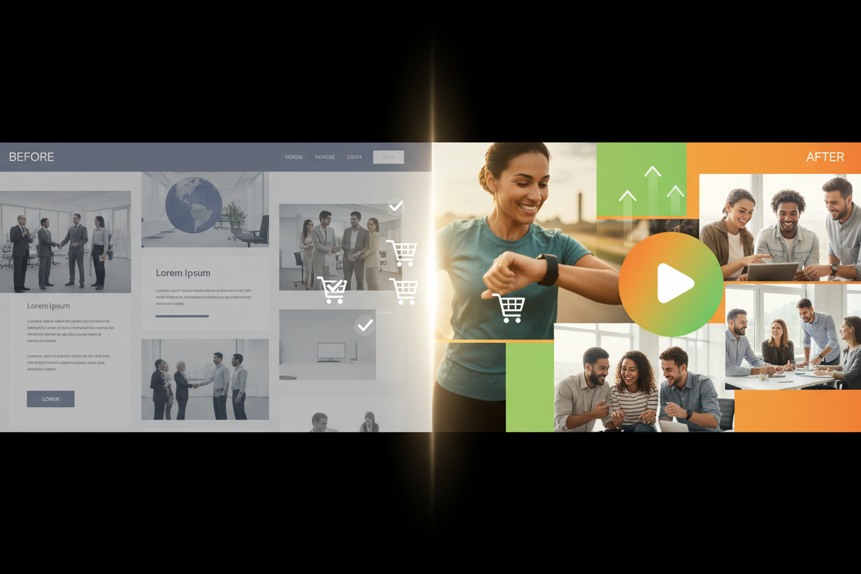
Essential Elements of High-Converting Landing Page Design
Every high-performing landing page shares certain core elements that work together to guide visitors toward conversion. Think of these as the non-negotiable building blocks of your conversion strategy.
Your headline is arguably the most critical element on your landing page. It needs to grab attention while clearly communicating your value proposition. The best headlines are specific, benefit-focused, and speak directly to your target audience’s pain points or desires. For example, instead of “Our Software is Great,” try “Cut Your Project Management Time in Half with Automated Task Tracking.”
Supporting copy should expand on your headline’s promise without overwhelming visitors with information. Use bullet points to highlight key benefits, and remember that people scan rather than read online. Your copy should flow naturally from problem to solution to action, creating a logical path toward conversion.
Visual hierarchy plays a crucial role in guiding visitor attention. Use contrasting colors, strategic white space, and varying font sizes to direct eyes toward your most important elements. Your call-to-action button should stand out visually while fitting naturally into the overall design flow.
Crafting Compelling Headlines That Convert
Your headline carries enormous weight in determining whether visitors stay or bounce. The most effective headlines combine clarity with curiosity, promising specific benefits while addressing the visitor’s immediate needs.
Start by identifying your audience’s primary motivation for seeking your solution. Are they trying to save time, make money, solve a problem, or achieve a specific goal? Your headline should speak directly to this motivation using language your audience actually uses, not corporate jargon.
Consider using numbers and specific outcomes in your headlines. “Increase Your Email Open Rates by 40% in 30 Days” performs better than “Improve Your Email Marketing” because it sets clear expectations and promises measurable results. The specificity builds credibility and helps visitors immediately understand the value you’re offering.
Test different headline approaches to see what resonates with your audience. Some respond better to question-based headlines that highlight pain points, while others prefer direct statements about benefits. The only way to know what works for your specific audience is through systematic testing.
Visual Design Principles for Maximum Impact
Great landing page design isn’t about following the latest trends – it’s about creating an experience that removes friction and guides visitors toward conversion. Visual design should serve your conversion goals, not distract from them.
Color psychology plays a significant role in visitor behavior. While there’s no universally “best” color for call-to-action buttons, contrast is key. Your CTA should stand out from the rest of your page while maintaining visual harmony. Red often creates urgency, blue builds trust, and green suggests safety or “go.” Choose colors that align with your brand and create the emotional response you want from visitors.
Typography affects readability and perception of professionalism. Stick to clean, web-safe fonts that are easy to read across devices. Use font hierarchy to guide attention – larger fonts for headlines, medium for subheadings, and smaller for body text. Avoid using too many different fonts, which can make your page look cluttered and unprofessional.
Images and videos can significantly impact conversion rates when used strategically. Hero images should support your message rather than just fill space. If you’re selling a product, show it in use. If you’re offering a service, consider using images of happy customers or your team. Videos can increase conversions by up to 80%, but they should be short, focused, and provide clear value.
Optimizing Call-to-Action Buttons for Higher Click-Through Rates
Your call-to-action button is where conversions happen, making it one of the most important elements to optimize. The best CTAs combine compelling copy with strategic design to create an irresistible next step for visitors.
Button copy should be action-oriented and specific about what happens next. Instead of generic phrases like “Submit” or “Click Here,” use benefit-driven language like “Get My Free Quote” or “Start My 30-Day Trial.” The copy should eliminate uncertainty about what visitors will receive when they click.
Size and placement matter enormously. Your CTA button should be large enough to notice easily but not so large that it overwhelms other page elements. Place it “above the fold” where visitors can see it without scrolling, but also consider adding secondary CTAs further down the page for visitors who need more information before converting.
Consider the entire conversion path, not just the button itself. What happens after someone clicks? Make sure the next step is clearly communicated and that the process feels seamless. If clicking leads to a form, mention that. If it starts a download, set that expectation. Reducing uncertainty increases conversions.
Mobile Optimization Strategies That Drive Results
With mobile traffic accounting for over half of all web traffic, mobile optimization isn’t optional – it’s essential for conversion success. Mobile users have different behaviors and expectations than desktop users, requiring a tailored approach to landing page design.
Mobile-first design means starting with the mobile experience and scaling up, rather than shrinking down from desktop. This approach ensures that your most important elements work perfectly on smaller screens. Buttons should be large enough to tap easily, forms should be simple to complete on mobile keyboards, and loading times should be lightning-fast.
Simplify your mobile landing pages even more than desktop versions. Mobile users are often multitasking or browsing quickly, so eliminate any non-essential elements that might distract from your primary conversion goal. Use shorter headlines, bullet points instead of paragraphs, and minimize the number of form fields.
Test your landing pages on actual mobile devices, not just desktop browser simulations. Real-world mobile testing often reveals issues that don’t show up in desktop testing, like buttons that are hard to tap or text that’s difficult to read in different lighting conditions.
A/B Testing Your Landing Page Elements
The most successful landing page optimizers never rely on assumptions – they test everything. A/B testing allows you to make data-driven decisions about what actually improves conversions rather than what you think should work.
Start by testing your biggest impact elements first: headlines, call-to-action buttons, and hero images. These elements typically have the largest effect on conversion rates, so improvements here will give you the biggest return on your testing investment. Test one element at a time to clearly identify what’s driving any changes in performance.
Create meaningful test variations that represent genuinely different approaches rather than minor tweaks. Testing “Buy Now” versus “Purchase Now” probably won’t yield significant insights, but testing “Start Free Trial” versus “Get Instant Access” might reveal important preferences in your audience.
Run tests long enough to achieve statistical significance, which usually means at least a few hundred conversions per variation. Don’t stop tests early just because one version appears to be winning – statistical noise can create false positives that lead to poor decisions. Most testing platforms will calculate statistical significance automatically, taking the guesswork out of when to end tests.
Common Landing Page Mistakes That Kill Conversions
Even experienced marketers fall into conversion-killing traps that can devastate landing page performance. Recognizing and avoiding these common mistakes can immediately improve your conversion rates.
One of the biggest mistakes is trying to accomplish too much on a single landing page. Every additional option or piece of information you add creates potential distraction from your primary conversion goal. Successful landing pages have one clear objective and remove everything that doesn’t support that objective.
Poor form design kills more conversions than almost any other factor. Long forms, confusing field labels, and unclear error messages create friction that sends visitors away. Only ask for information you absolutely need, use clear labels, and provide helpful error messages when fields aren’t completed correctly.
Slow loading times are conversion killers in our instant-gratification world. If your landing page takes more than three seconds to load, you’ll lose a significant percentage of visitors before they even see your offer. Optimize images, minimize code, and consider using a content delivery network to improve loading speeds across different geographical locations.
Conclusion
Creating high-converting landing pages isn’t about following a rigid formula – it’s about understanding your audience, testing systematically, and continuously optimizing based on real data. The strategies we’ve covered in this guide provide a solid foundation, but remember that what works for one business might not work for another.
The key to landing page success lies in the details: crafting headlines that speak directly to your audience’s needs, designing visual hierarchies that guide attention naturally, and creating friction-free conversion paths that make taking action feel inevitable rather than risky.
Start implementing these strategies one at a time, test everything, and be patient with the process. Small improvements compound over time, and what might seem like minor tweaks can lead to significant increases in conversion rates. Your landing page is often your best opportunity to turn marketing spend into revenue – make it count.
Remember, the best landing page is the one that converts best for your specific audience and goals. Use these principles as your guide, but always let data drive your decisions. With consistent testing and optimization, you’ll transform your landing pages from digital brochures into powerful conversion engines that grow your business.
No More BS – Get a FREE Consultation
No more BS. Let’s talk real world $#!+ about what you need. You’ll meet with our top dog, and you’ll leave with a better understanding of what you need to do, and how RyCOM might help.